-
Client
NEFCO
-
Industry
Architecture & Construction
-
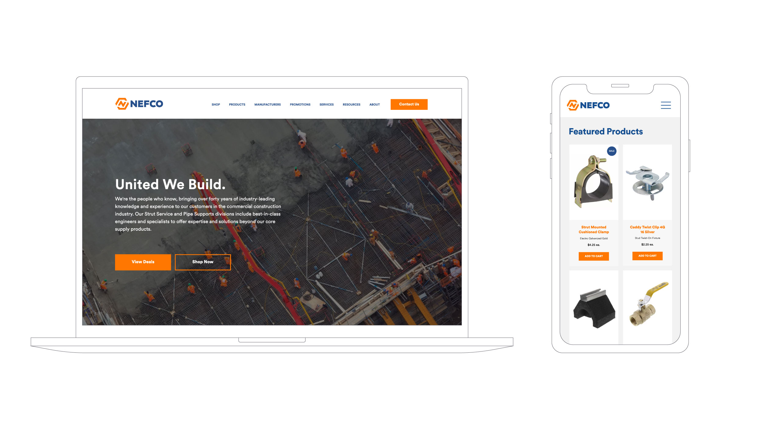
What We Did
Brand Strategy, Visual ID, Messaging, Marketing Collateral, Website Design, Illustration, and Brand Consulting
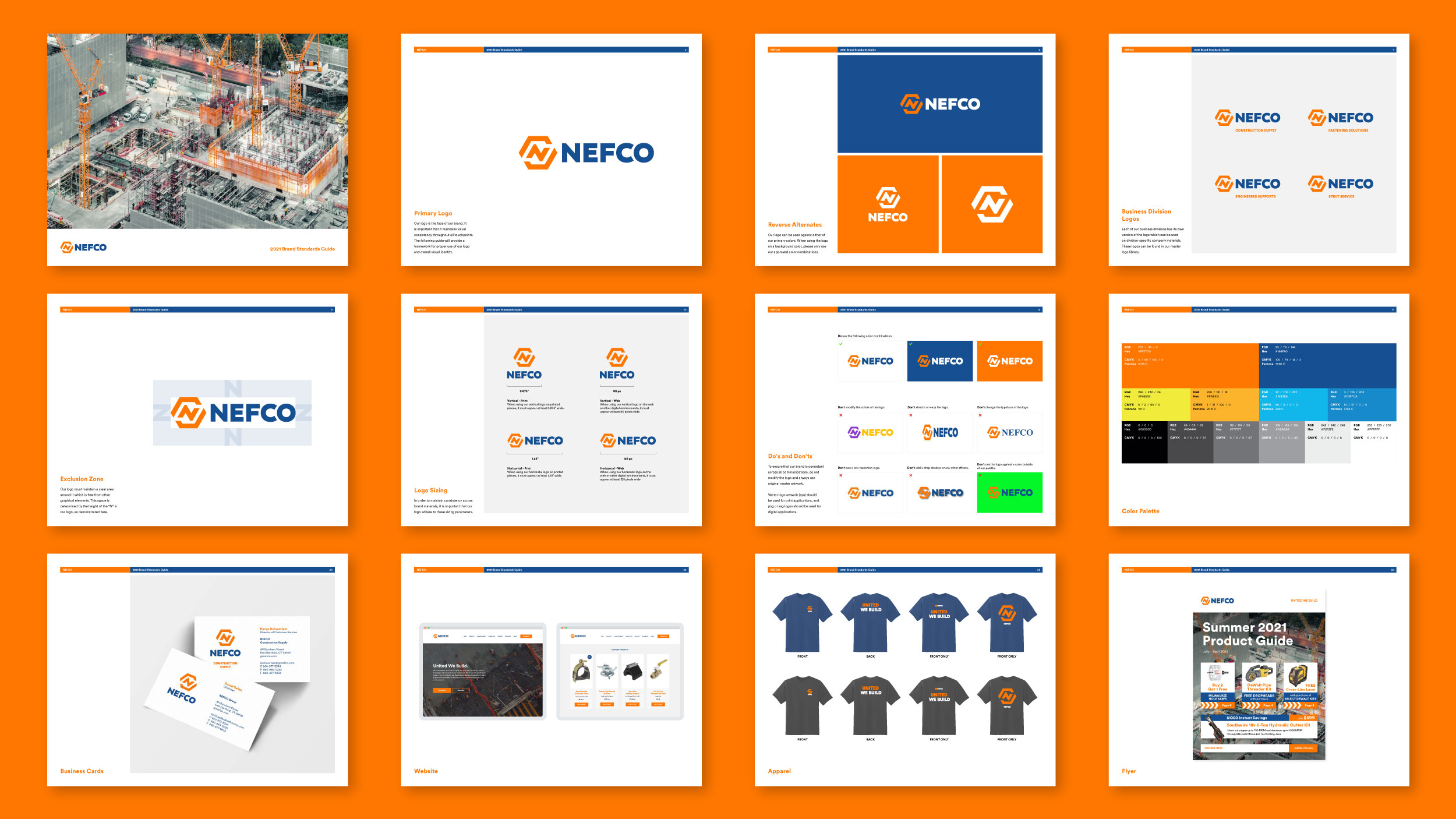
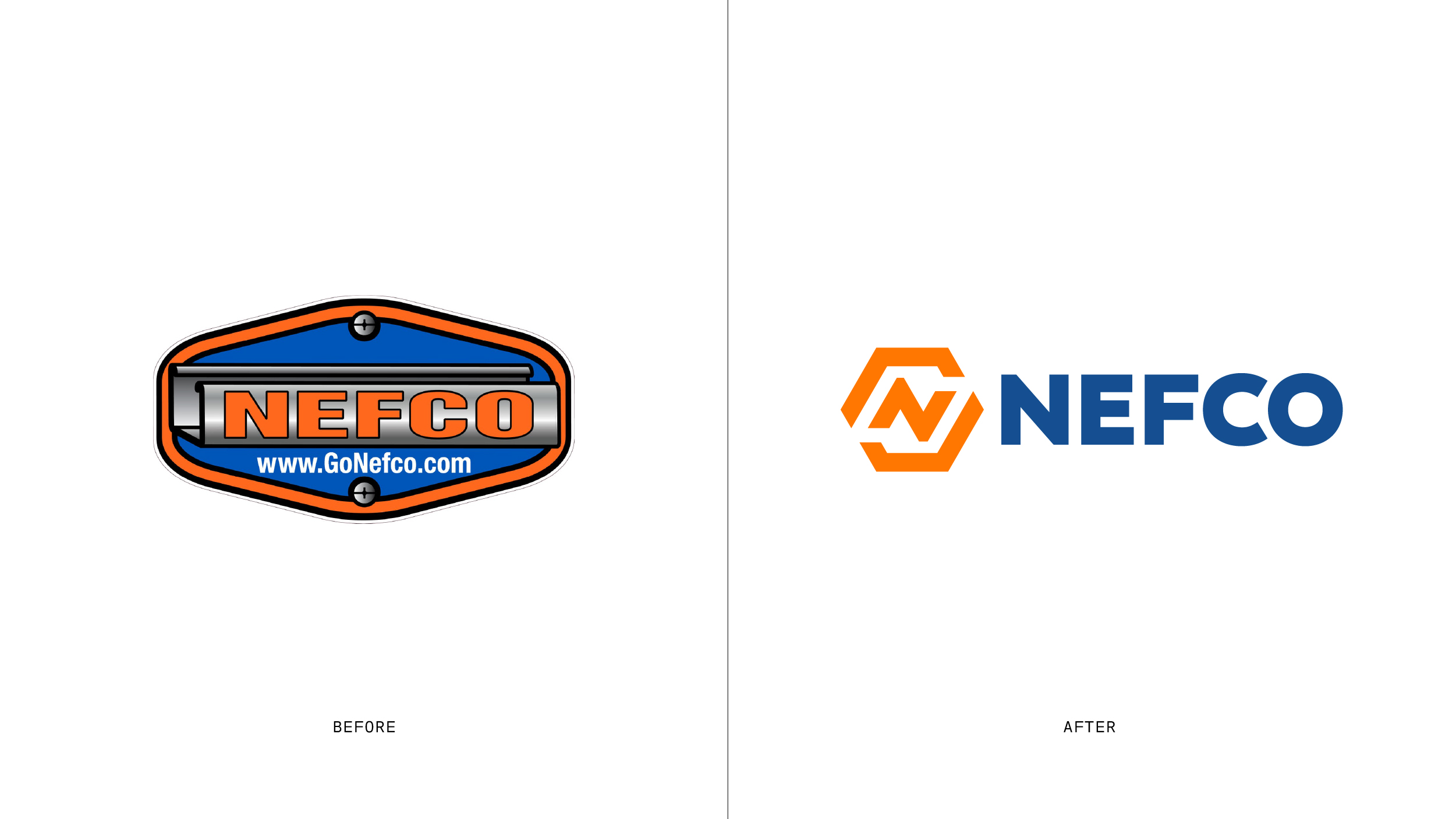
With four decades of experience in the construction industry, NEFCO had well established itself as a dependable go-to for inventory and supply across the eastern seaboard. While their service and ethos had stood and succeeded upwardly through the test of time, their branding was out-of-step with the present.
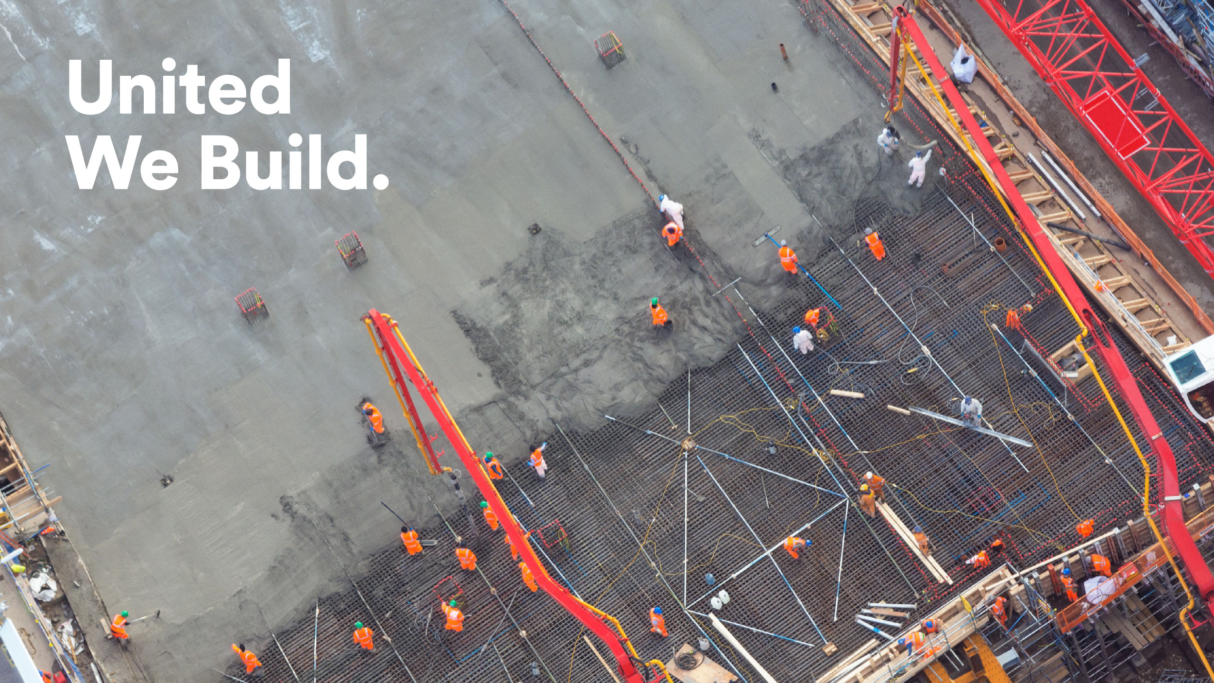
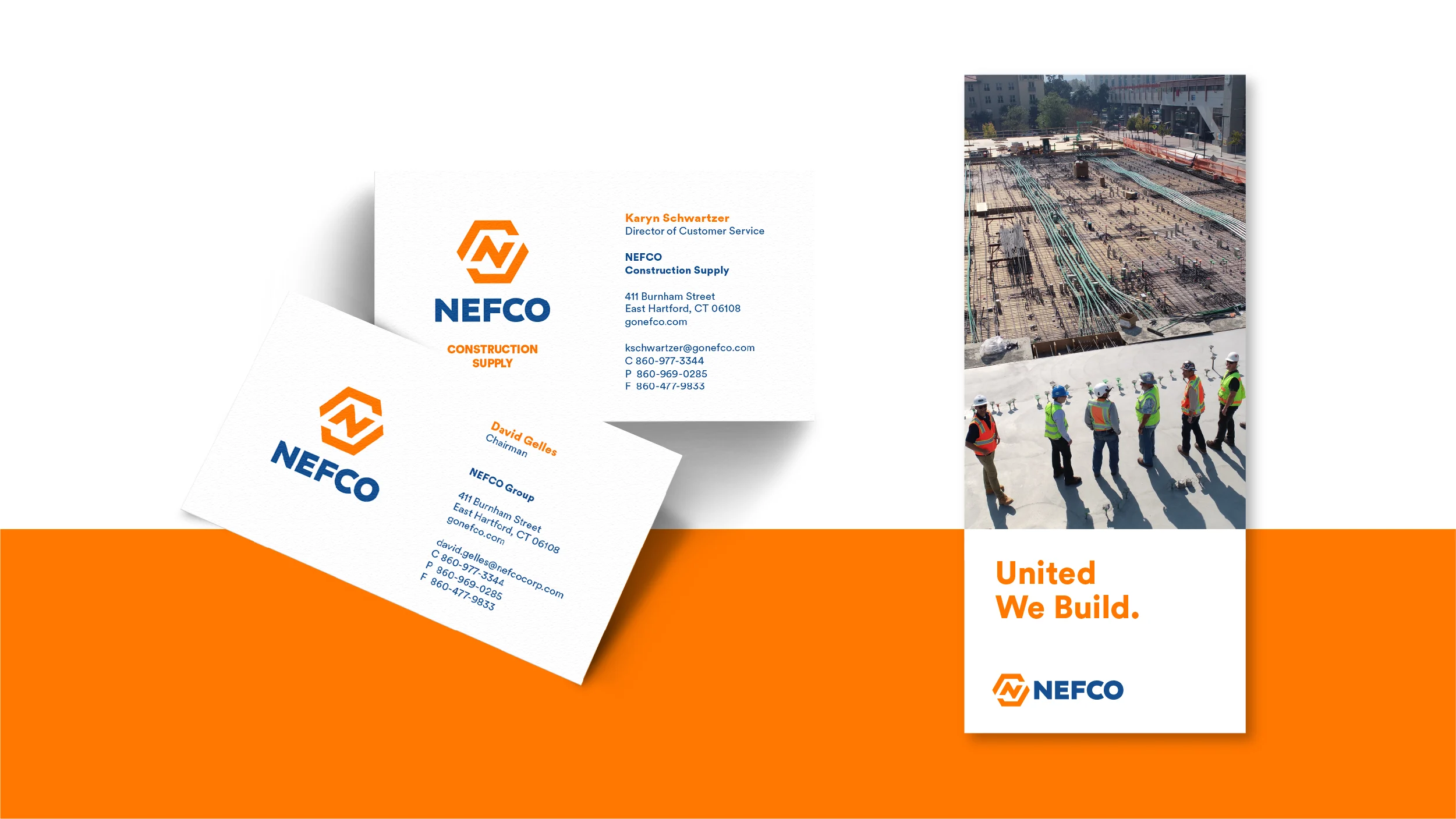
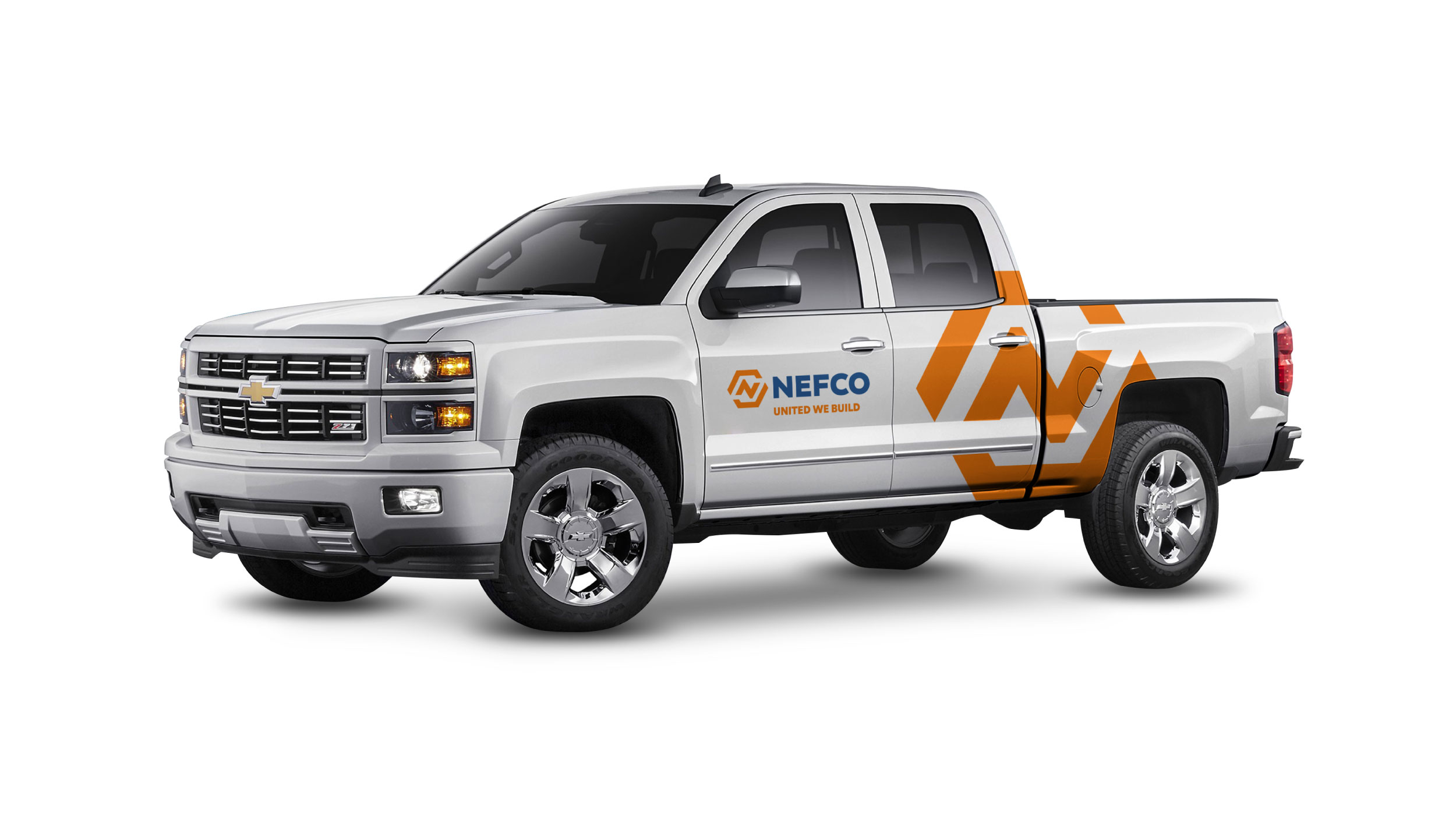
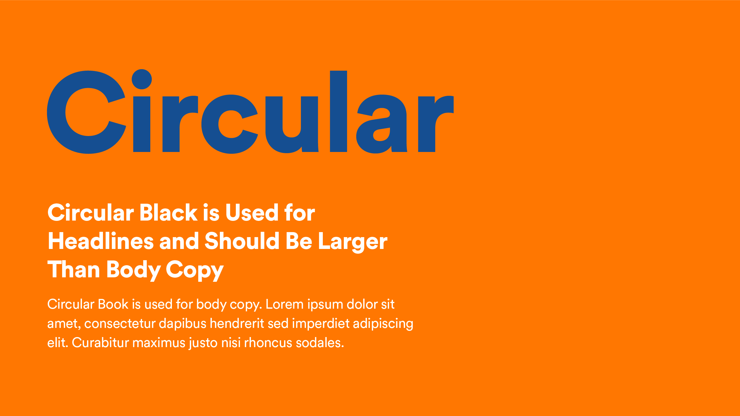
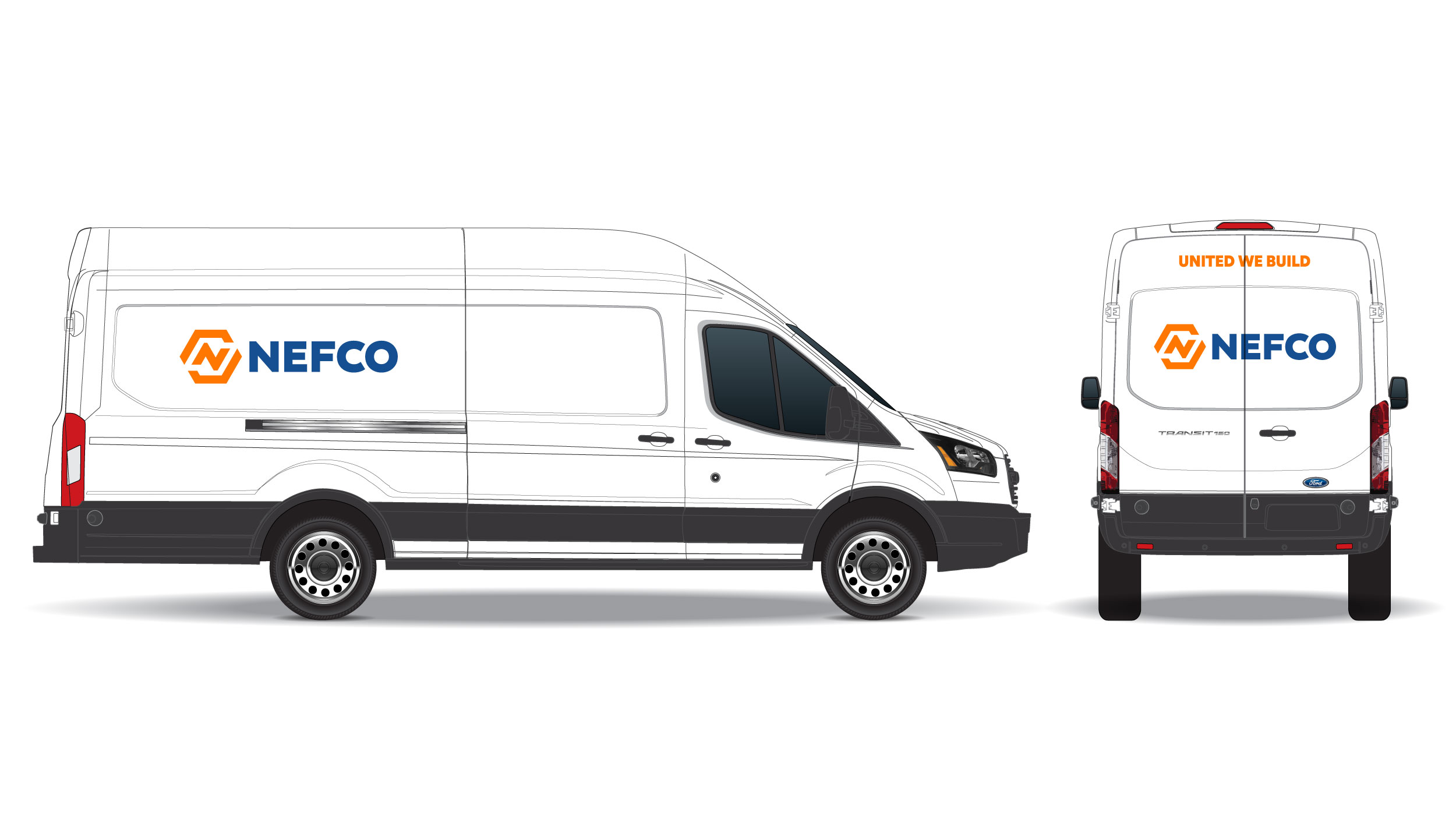
NEFCO came to us with a visual ID created in the 1980s that needed a redesign into something that would resonate in today’s digital world. When we started reconstructing NEFCO’s visual identity, we knew it needed to feel powerful, modern and precise while supporting their motto: United We Build.
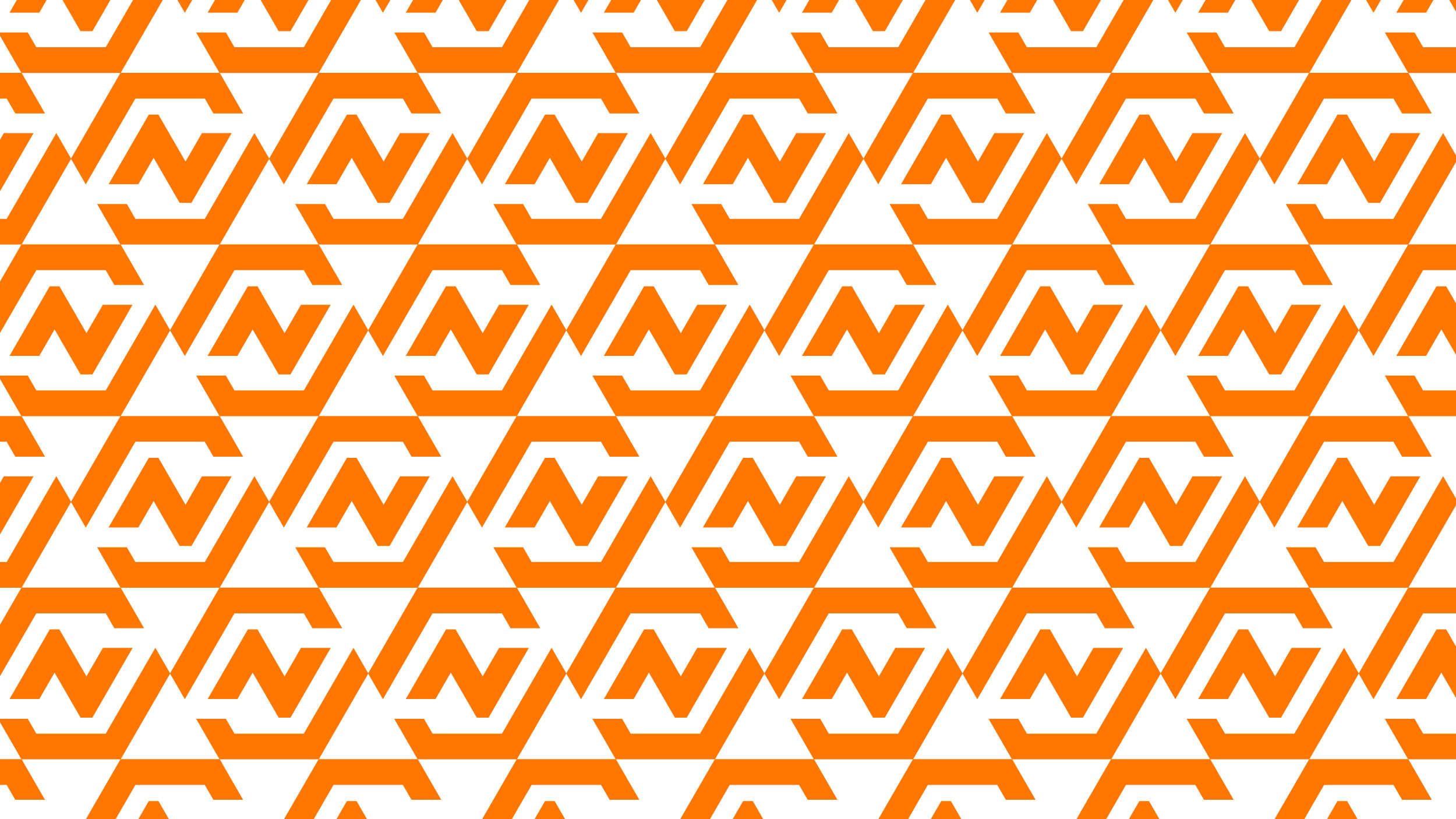
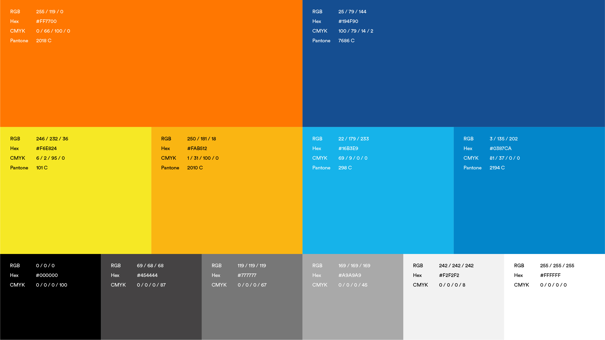
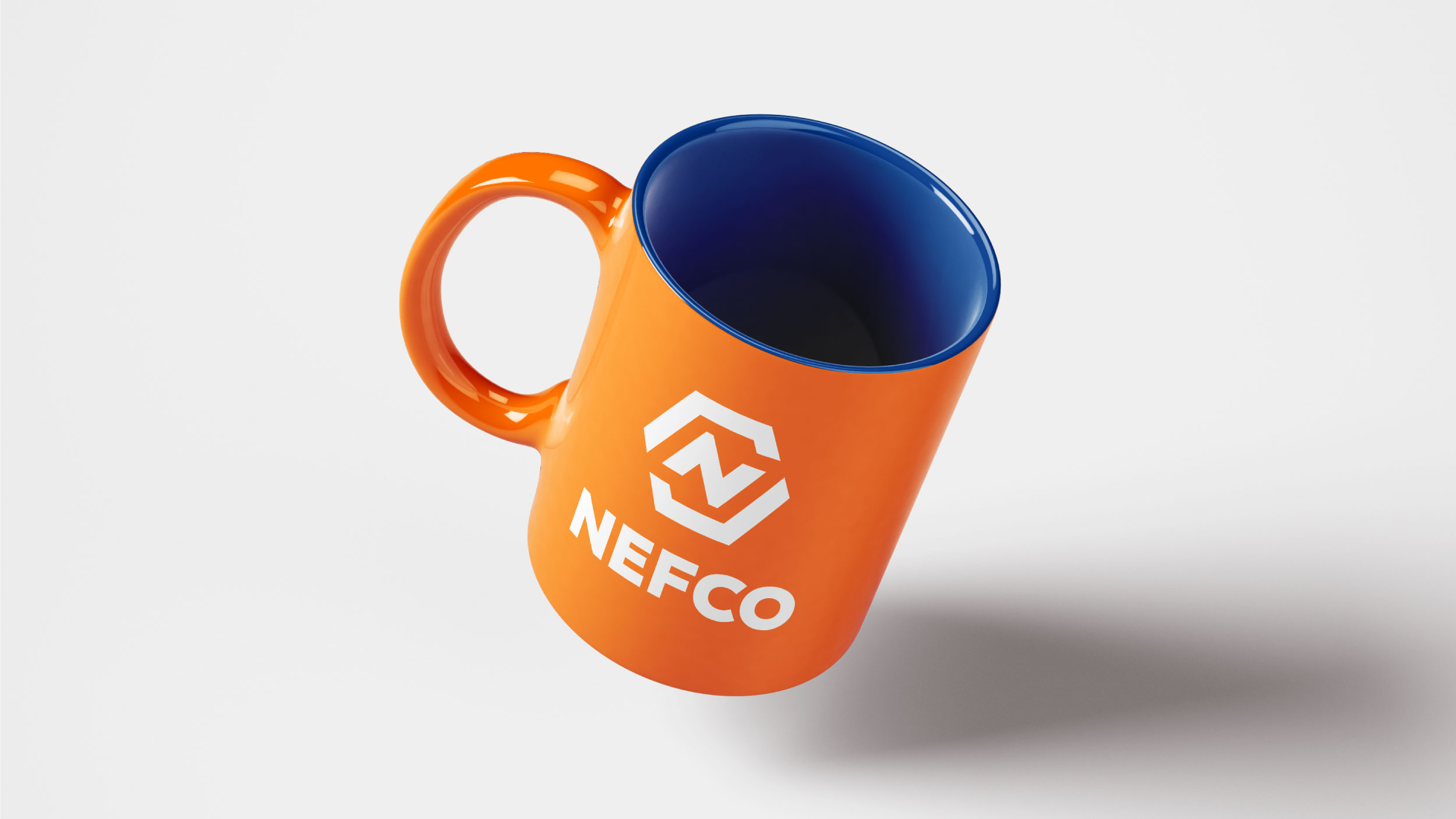
Utilizing a bright construction orange, we created the “connected N” icon, a multi-layered design with angular symmetry and visual depth. Buoyed by a strong blue wordmark, the two elements work in tandem to tell a color story that grounds NEFCO in their community-driven, supply-chain expertise.