-
Client
Cardinal Financial
- Industry Finance
-
What We Did
Brand Positioning, De-Positioning, Brand Narrative, Brand Architecture, Tone of Voice, Messaging, Visual Identity, Typography, Photography Direction, Brand Assets
Mortgage lenders love to make it sound easy. Fast approvals. Fast applications. Fast closings. But anyone who has been inside the process knows the gap between a fast start and a clean finish. Borrowers get rushed through the front door, then put through the wringer of missing documents, surprise conditions, manual handoffs, and last-minute chaos. Loan officers chase answers. Brokers manage anxiety. Everyone is told the process is simple until the timeline gets real.
Cardinal Financial had spent years building a better mortgage engine. Octane, its proprietary platform, was not a prettier portal or another tech layer on top of old infrastructure. It was a working engine built to remove the friction that slows deals down and wears people out: zero-click appraisal ordering, self-healing workflows, live status, one source of truth, and smart logic that adapts as loans change.
The category opening was clear. Rocket, Better, UWM, and the broader field had trained the market to expect sleek interfaces and instant promises. But the weakness was hiding behind the screen. Fast starts that still depended on human bottlenecks. “Instant” approvals that cracked under pressure. Better-looking technology that did not make the process feel more certain.
We built the strategy around a sharper definition of speed: not marketing fast, but operational fast. Speed with proof behind it. Speed that gives borrowers, brokers, and loan officers more confidence in what happens next. That became the foundation for a no-mystery mortgage brand built to replace chaos with clarity from first click to close.
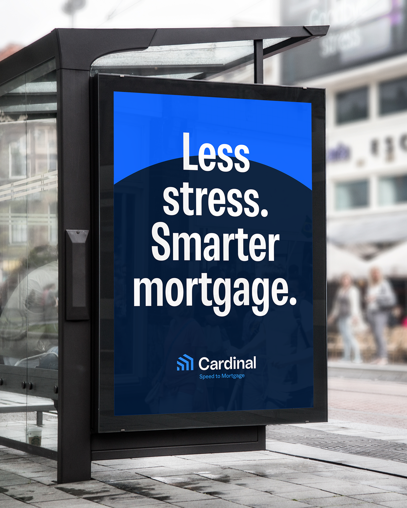
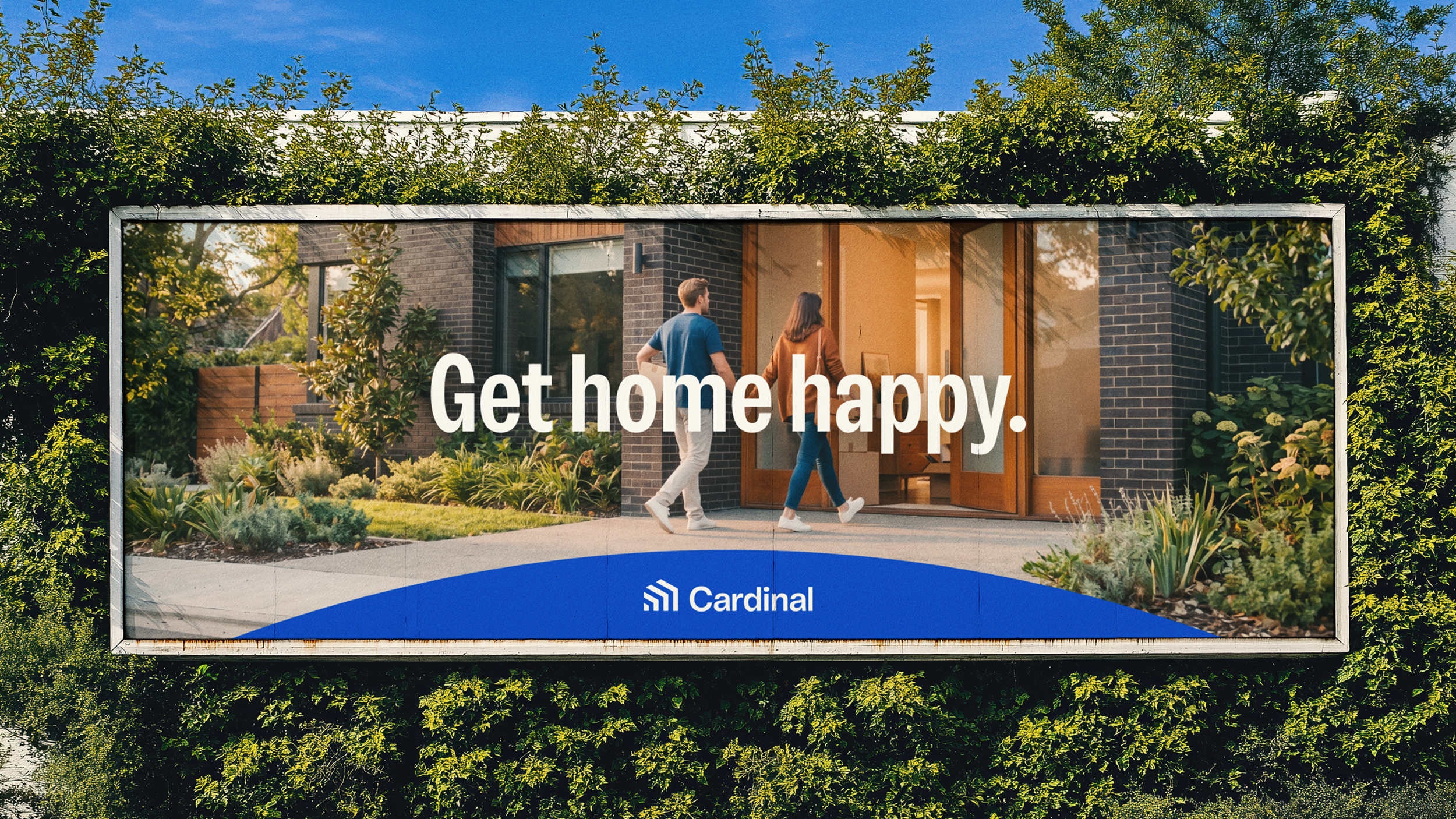
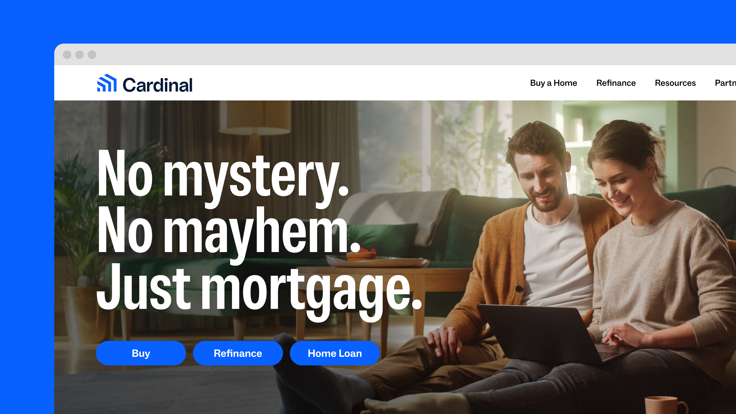
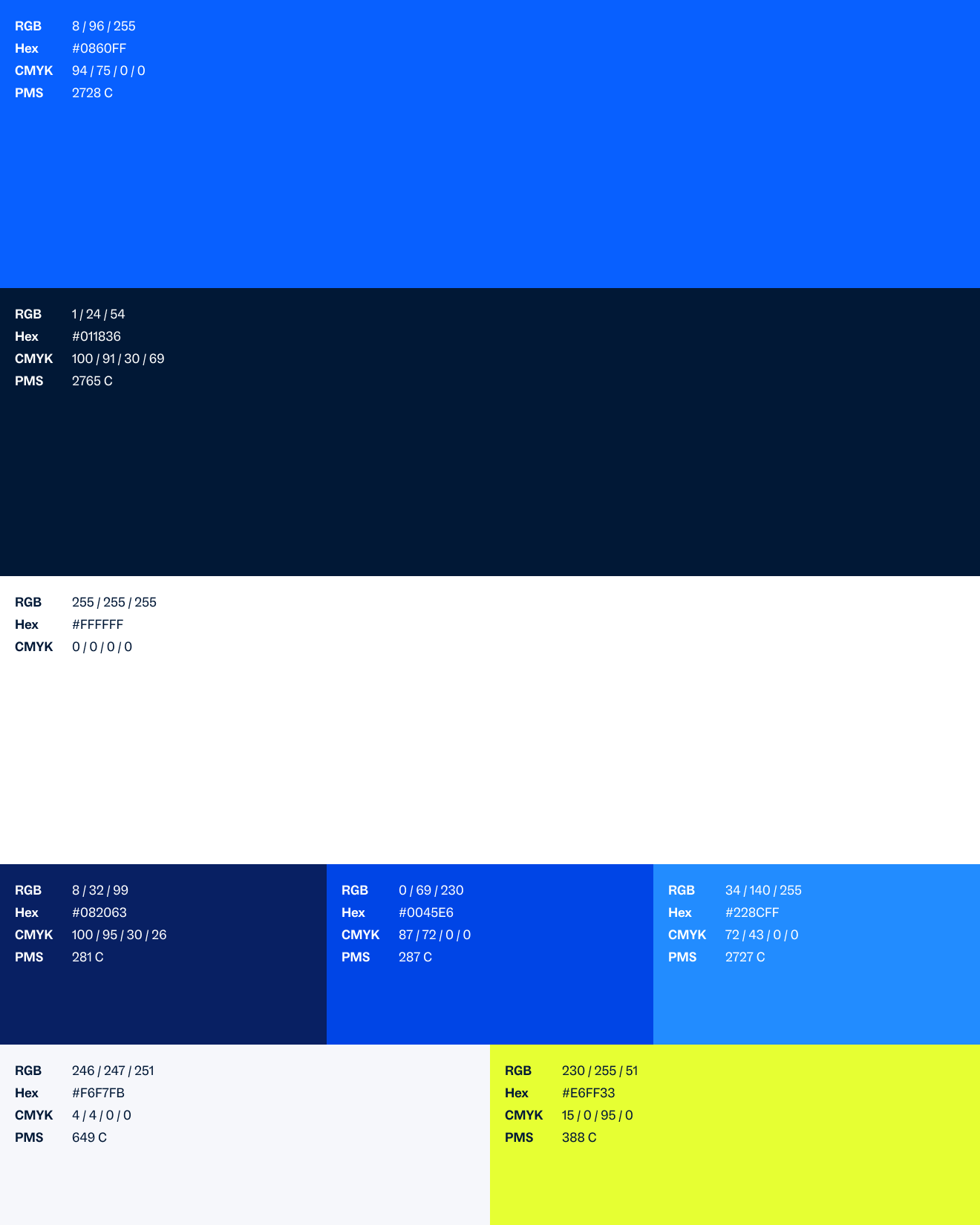
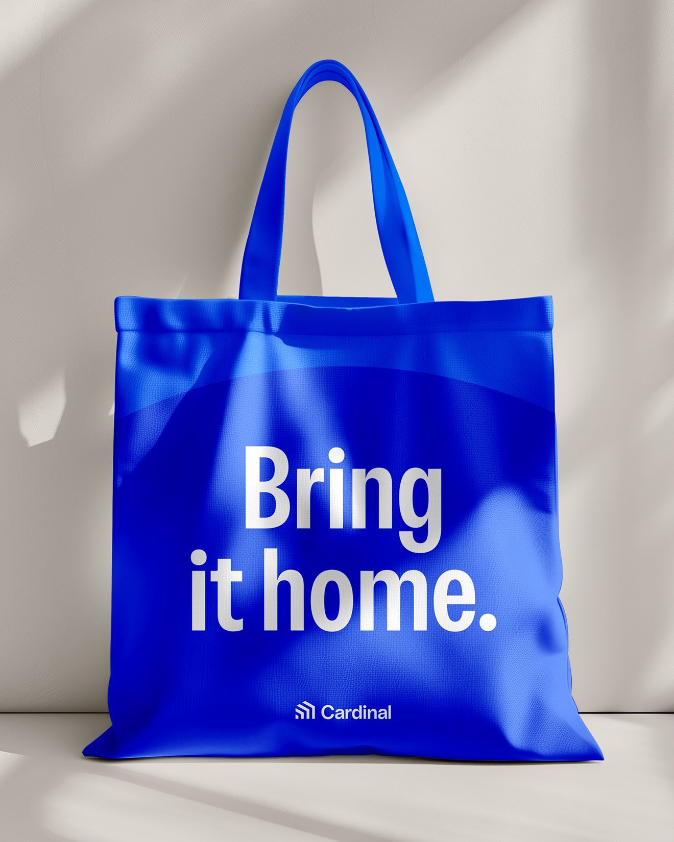
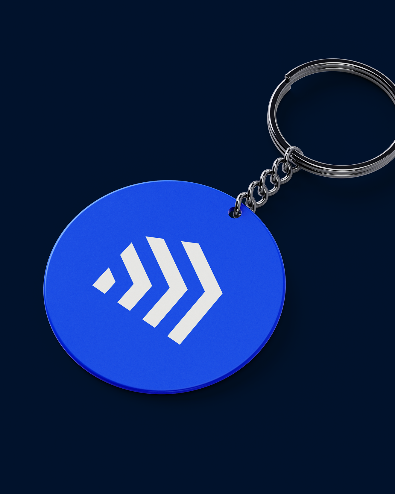
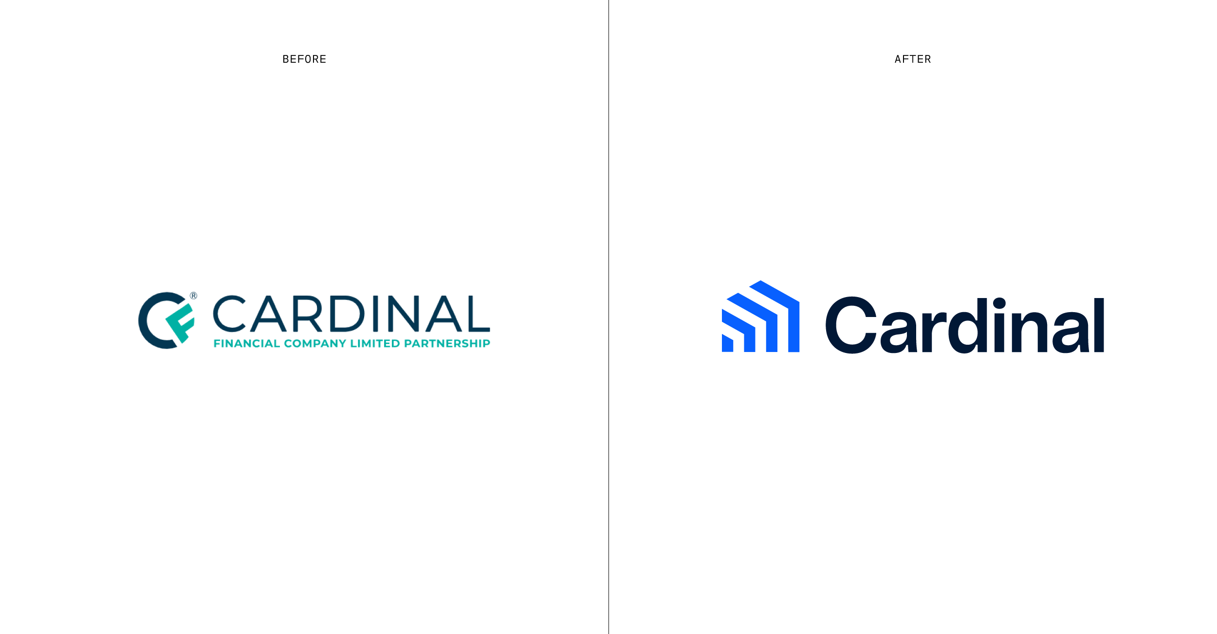
From there, we built a full brand system spanning positioning, messaging, employee value proposition, recruitment, wholesale, and visual identity. The language made the fight clear: busywork, chasing answers, false confidence, human error. The identity made the ambition visible, with a sharper blue palette, a dual-logo system, motion-led graphics, candid photography, and an icon that turns upward-moving arrows into the shape of a home.
The result is a brand built around what Cardinal can actually deliver. Not speed as a slogan. Speed as a system. A clearer market position, a stronger internal rally, and a more ownable way to tell the story of a mortgage company built for real approvals, real numbers, and confidence at every step.