-
Client
Transwestern
- Industry Real Estate & Construction
-
What We Did
De-Positioning, Visual Identity, Brand Messaging, Brand Narrative, Design
When we met Transwestern, the business was already outperforming the category. Privately held and relationship-driven, the firm operated across investment, development, and services with real integration in practice. But externally and internally, Transwestern still showed up as three distinct brands. Each business line told its own story, used its own language, and expressed its value independently. The result was a platform that worked as one, but looked and sounded fragmented.
The category only amplified the problem. Commercial real estate had become a sea of indistinguishable giants competing on scale, technology, and polish. Integration was promised but rarely felt. Shareholder-first models produced siloes, rotating teams, and transactional relationships that broke continuity when it mattered most. Clients weren’t lacking options. They were lacking accountability. What they wanted was a partner who could break the cycle of misalignment and stay dedicated to the client outcome, end to end.
We repositioned Transwestern around a single, unifying idea: owning the outcome. The strategy reframed the firm from a collection of complementary businesses into one aligned partner, structurally built to deliver continuity across the full real estate lifecycle. By naming the client pain point and de-positioning scale-driven competitors, the positioning clarified how Transwestern’s private ownership, people-powered culture, and dedication created a fundamentally different experience. One Transwestern. One promise. Delivered across every business line.
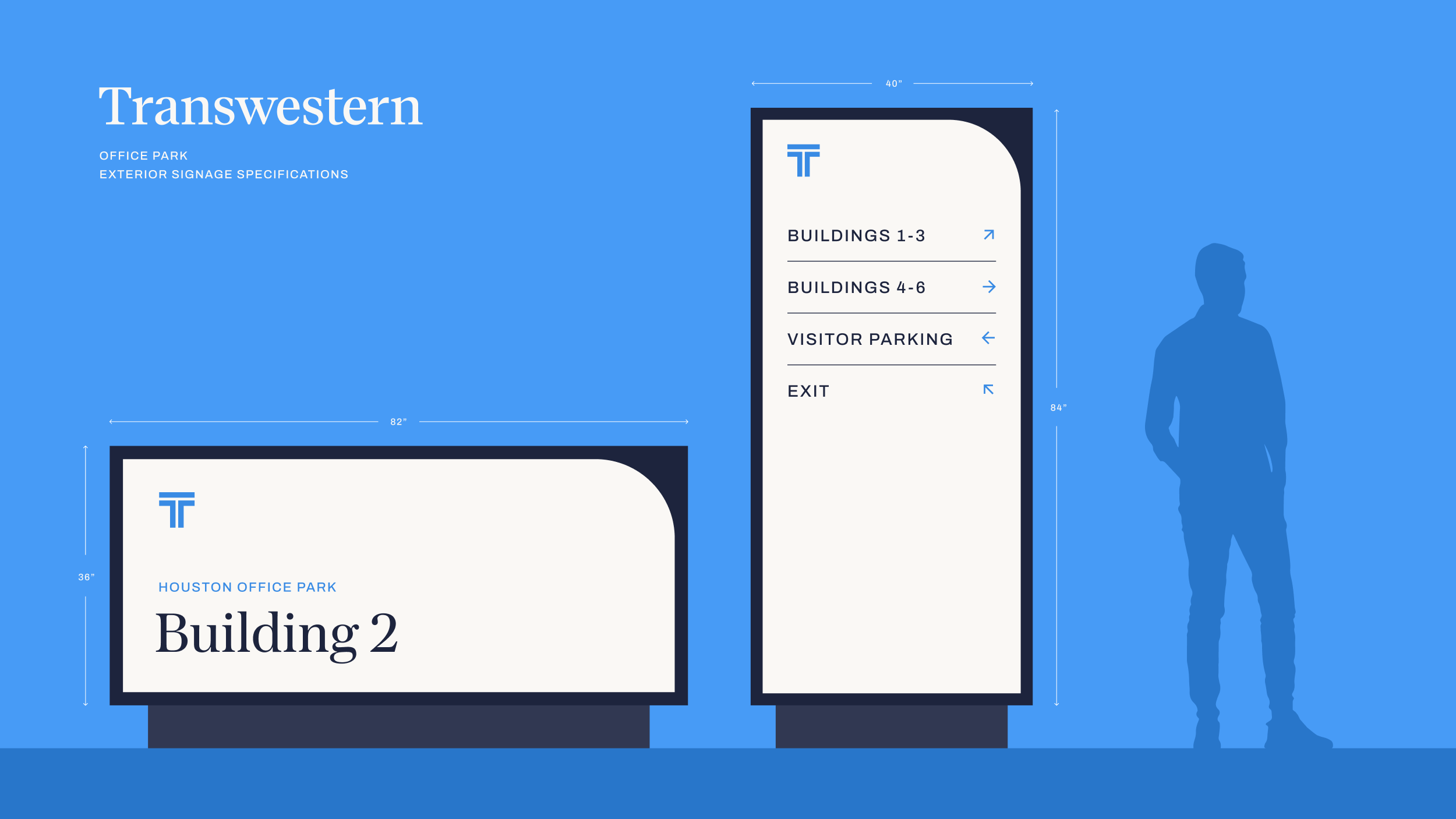
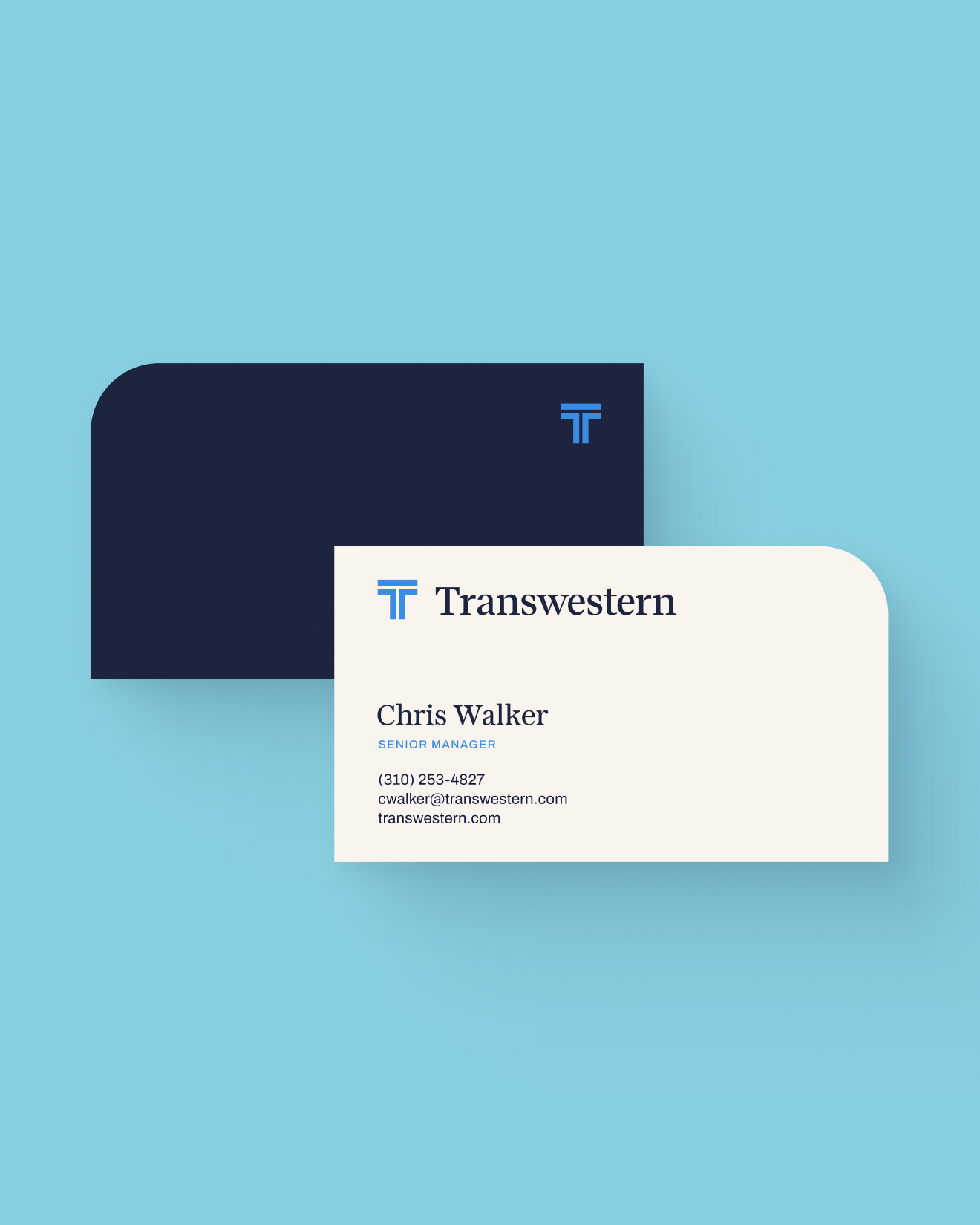
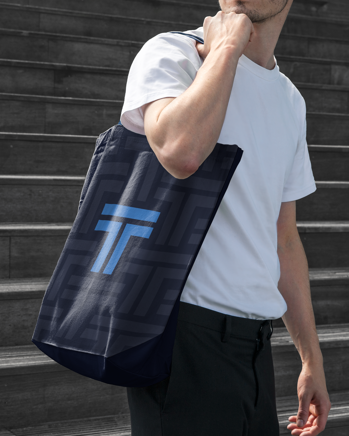
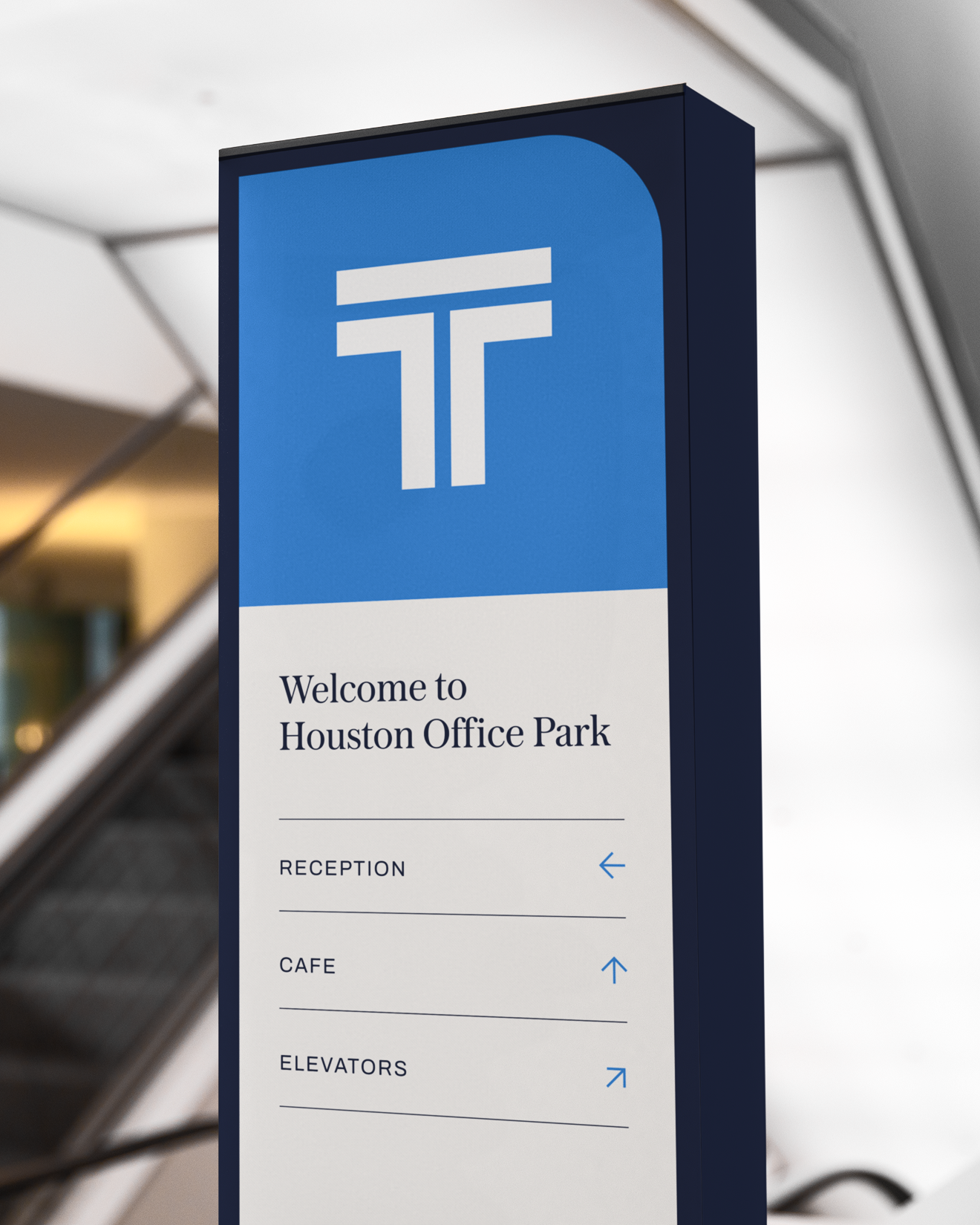
The visual identity made that unity tangible, beginning with an evolution of the logo itself. We preserved the equity of the existing mark while refining and modernizing it to support a single, forward-looking Transwestern. Built from that foundation, the system balanced discipline with flexibility, mirroring the way the business operates. A rigorous grid established consistency across the platform, while a signature detail—the Flexible Edge, derived from the curvature of the Transwestern wordmark—introduced adaptability without decoration. The result replaced three visual languages with one cohesive identity designed to scale across teams, markets, and touchpoints without losing integrity.
The launch brought Transwestern together as one brand in practice and perception. Internally, teams gained a shared language and a clear way to show up as one company. Externally, the brand now reflects what clients experience firsthand: a unified partner built to stay aligned, navigate complexity, and deliver outcomes that last.