-
Client
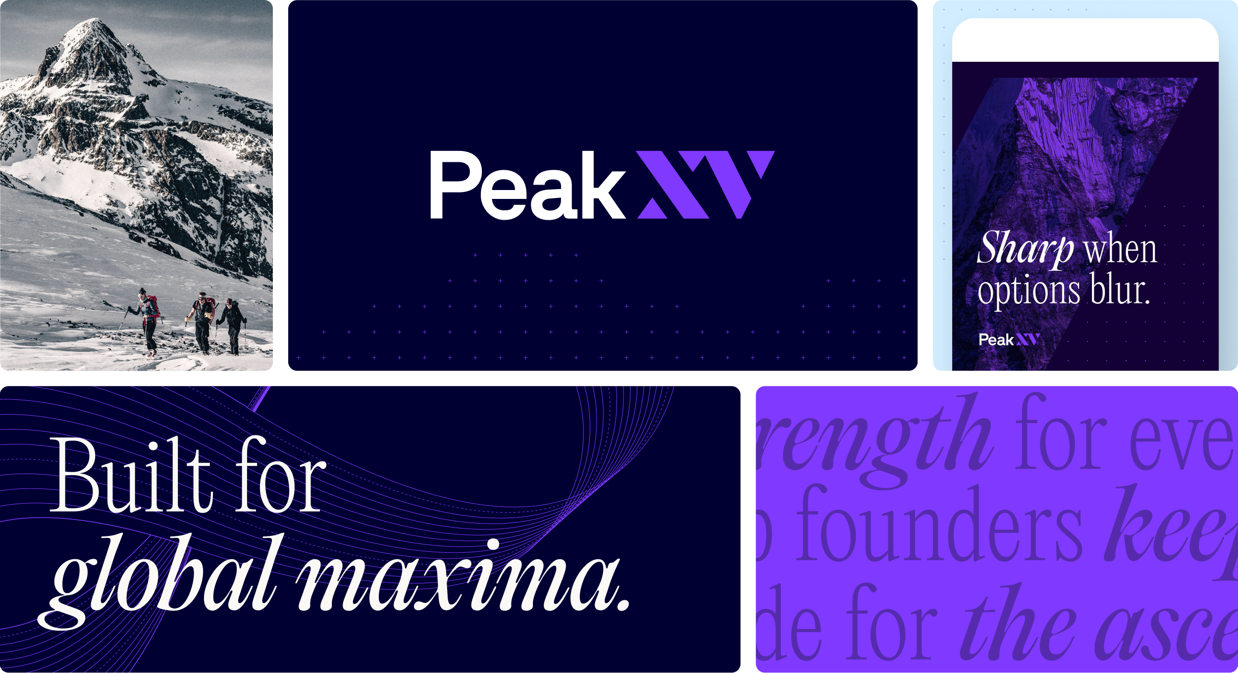
Peak XV
- Industry Finance
-
What We Did
Brand Positioning, De-Positioning, Brand Narrative, Tone of Voice, Visual Identity, Typography, Photography Direction, Website Design, Website Development, Website Copywriting
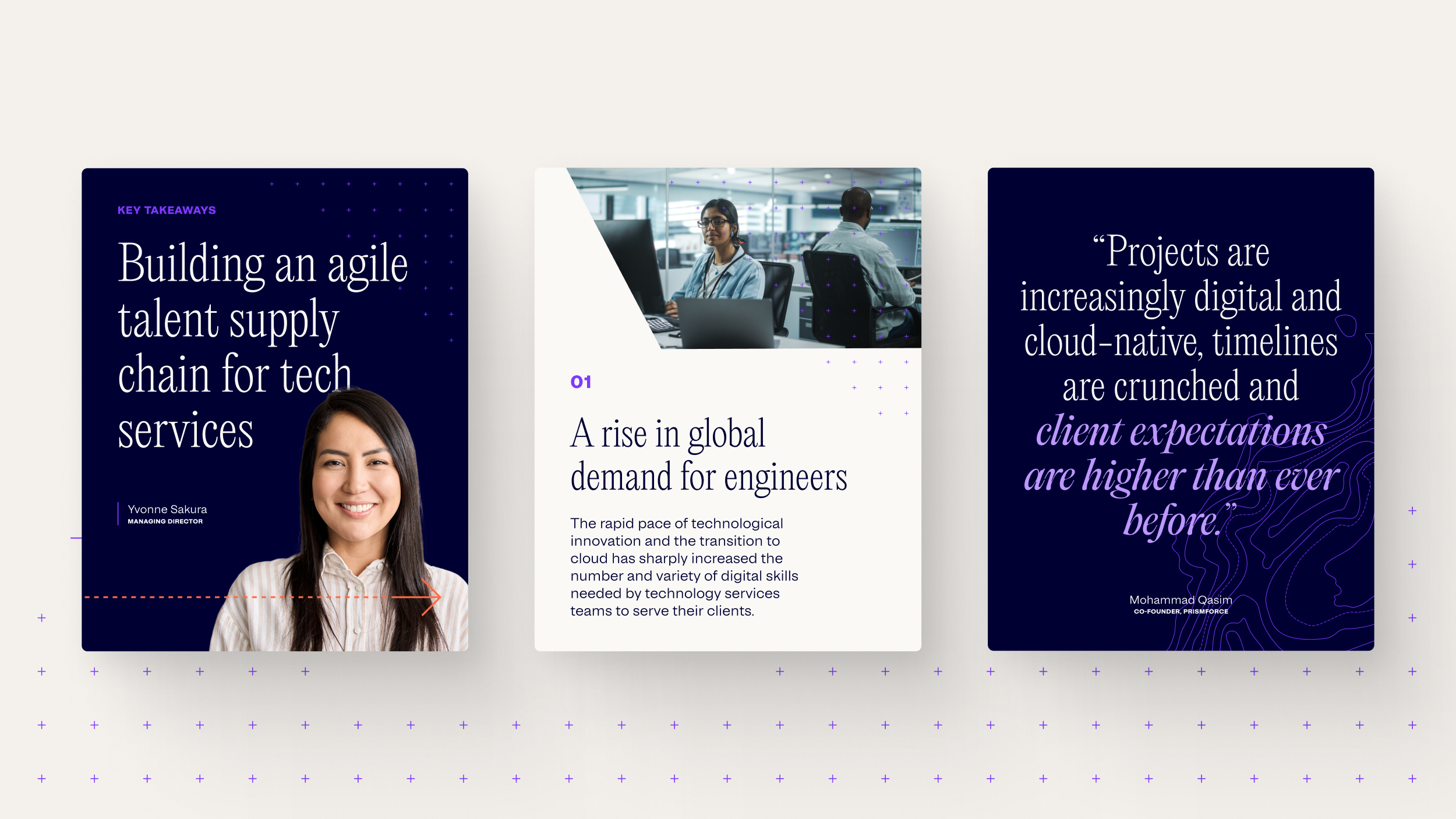
Peak XV, formerly Sequoia Capital India & Southeast Asia, faced a defining brand challenge. The firm had 20 years of founder trust across India, Southeast Asia, and beyond, a deep company-building legacy, and a new independent chapter ahead. The opportunity was not to manufacture relevance, but to reintroduce a known force with a story clear enough for its next horizon.
Founders carry the weight of the future before the future exists. Every decision has consequences. Every hire changes the company. Every market shift tests belief. When the pressure to perform hits hardest, founders do not need another investor performing conviction from a distance. They need a steadying force close enough to help.
The venture capital category has a Vanity Capital problem. Too many firms chase attention, perform certainty, claim wins retroactively, and turn founder support into their own brand theater. It is capital built around the optics of the deal or the hotness of the take, and not the substance of the climb.
We identified what Vanity Capital could not credibly claim: steady strength. Peak XV was not just a source of capital, but a full-cycle partner that multiplies value through long-term relationships, localized intelligence, global community, continual learning, and proven company-building support. This became the strategic foundation. Value Multiplier. Steady Strength. Heart not hype.
The positioning gave Peak XV a clearer role in culture and in-market. Against short-term pops, Peak XV stands for long-term arcs. Against bullish bravado, focused attention. Against self-mythologizing, community-building. Against hype, heart. It also connected the firm’s founder philosophy to a deeper institutional story: capital designed to compound beyond financial return, where company-building success can ultimately support education, research, healthcare, and other public-good institutions.
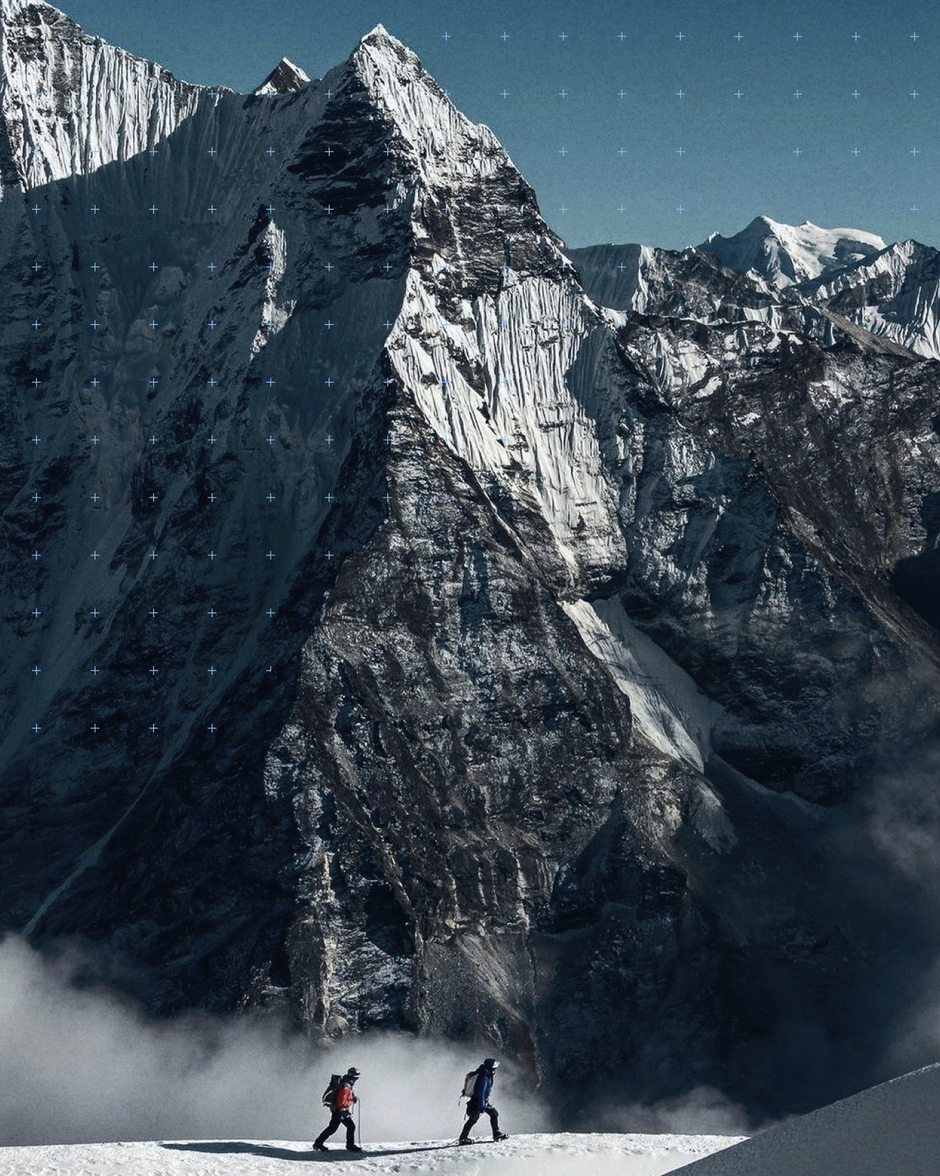
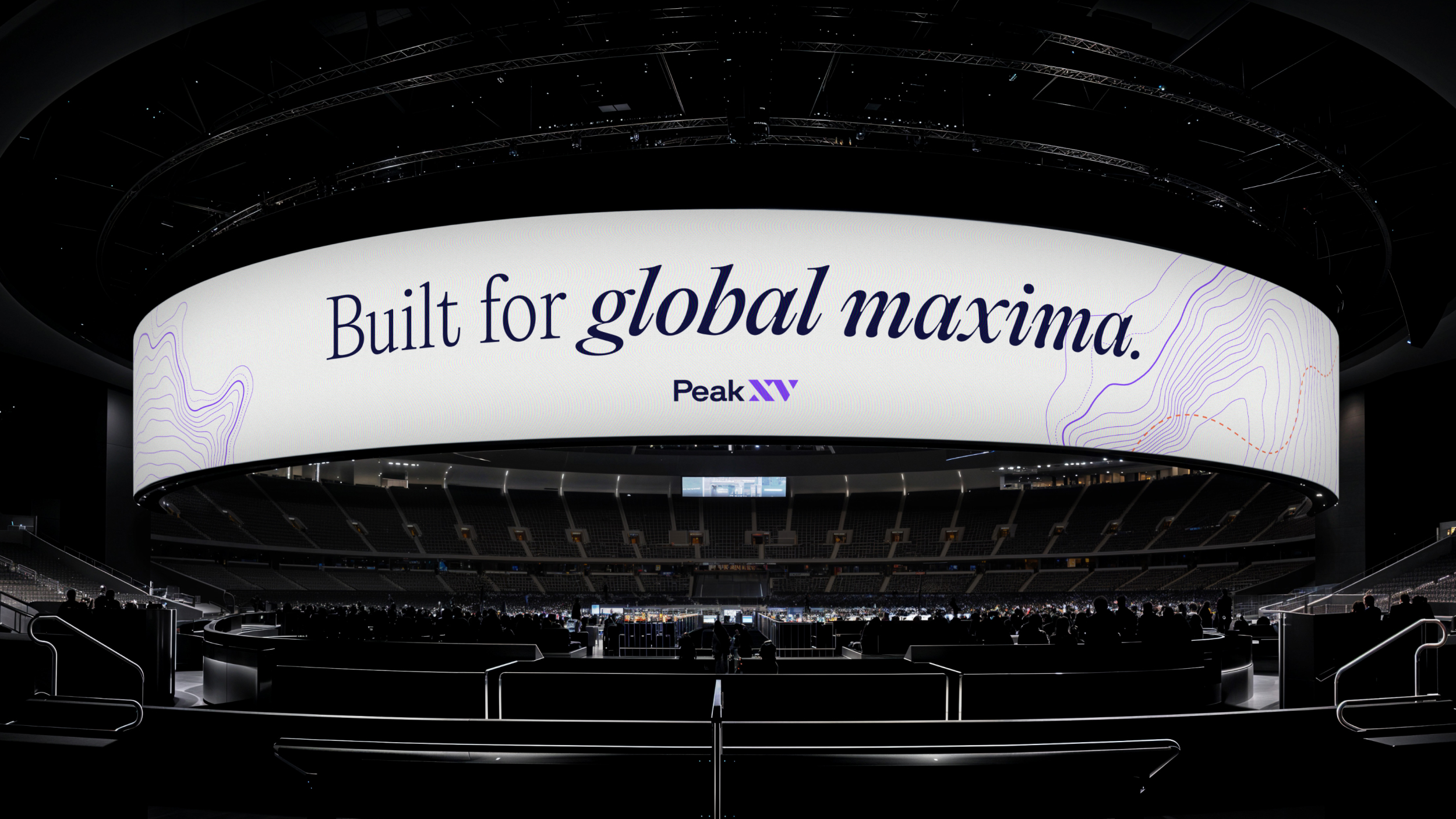
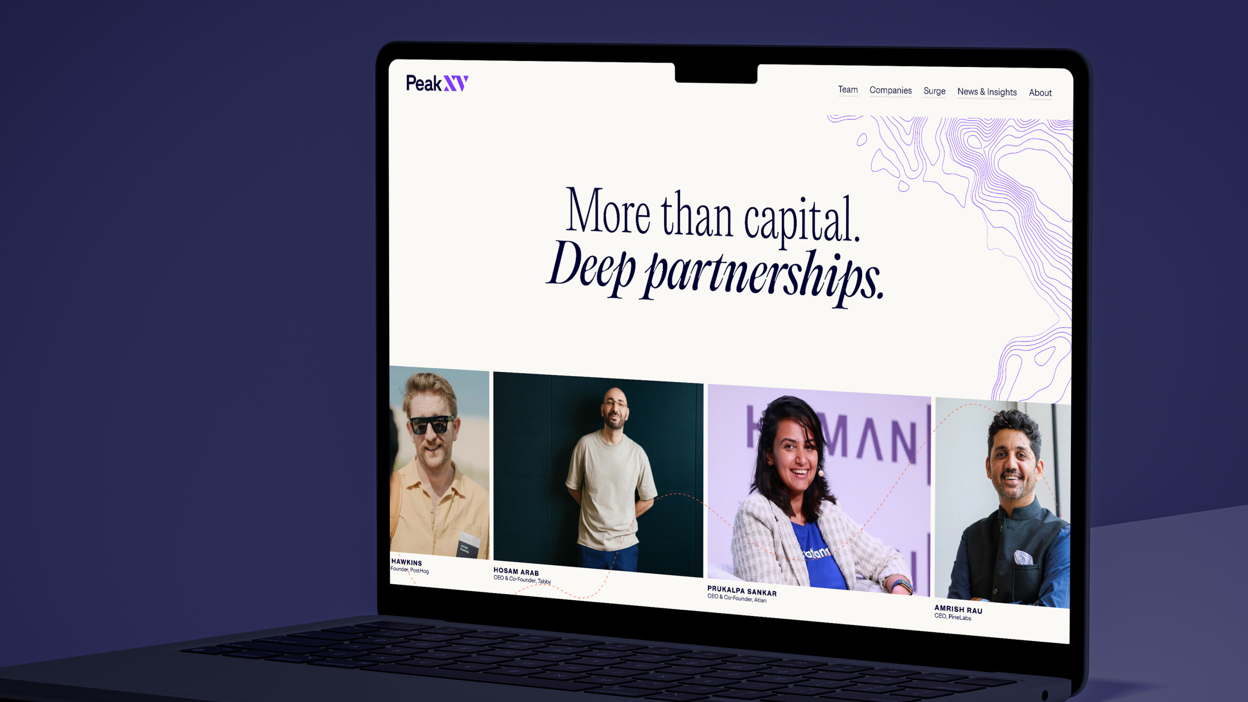
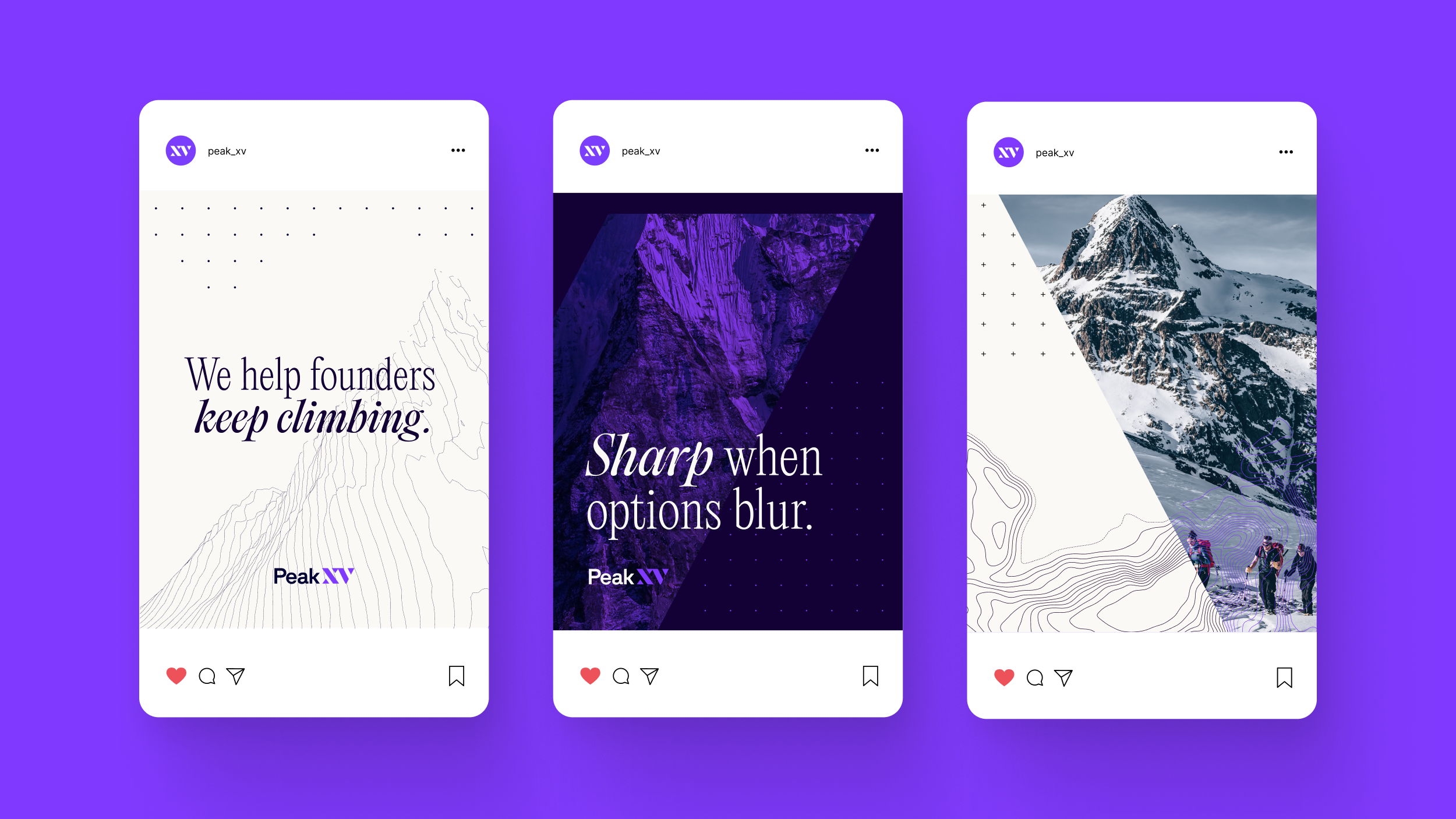
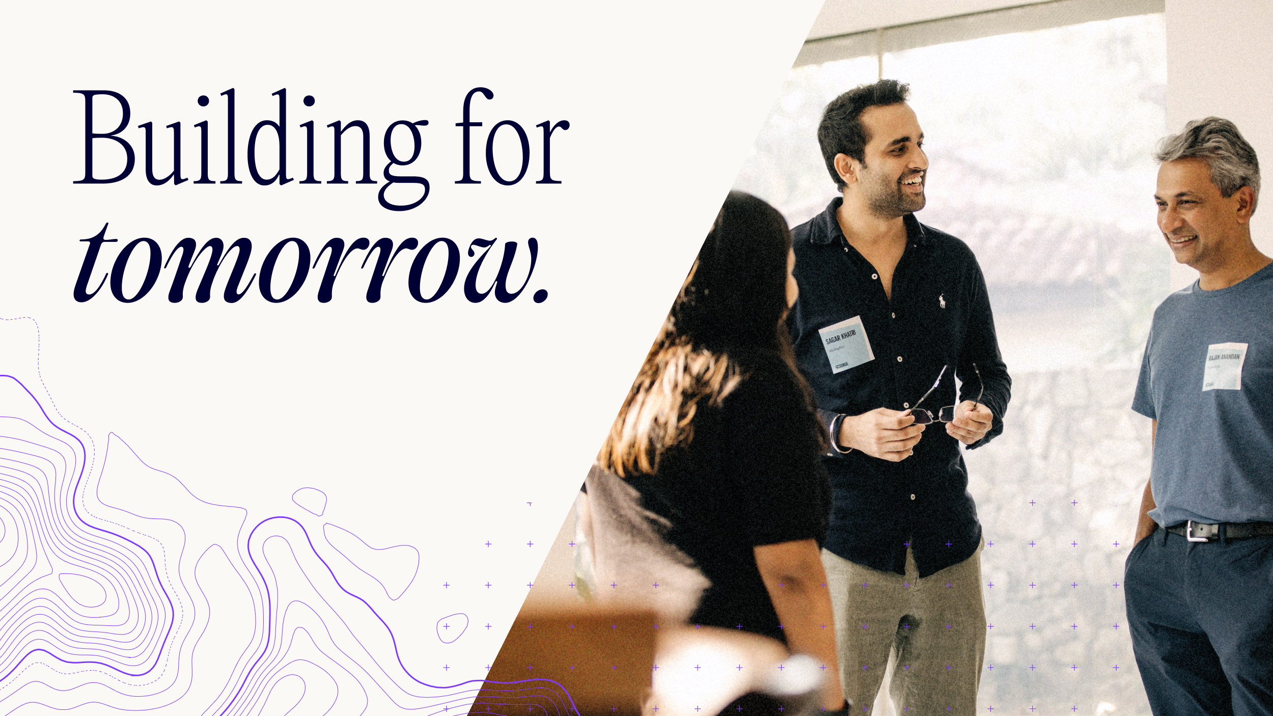
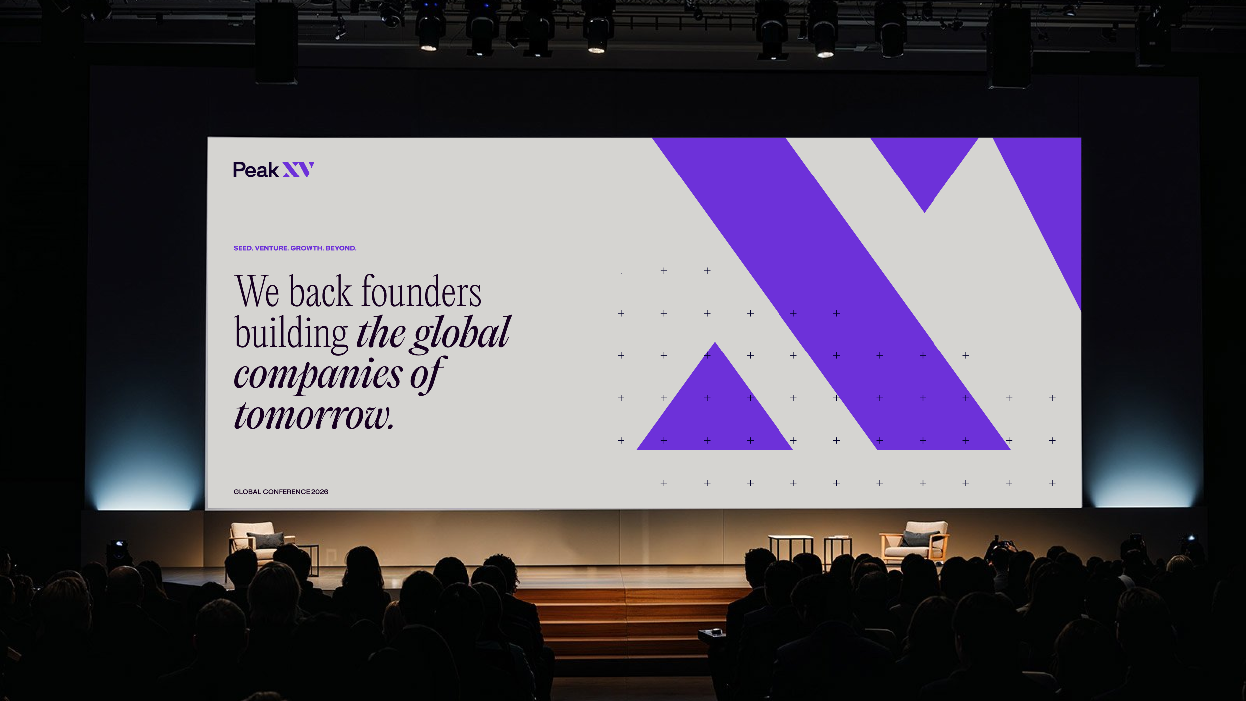
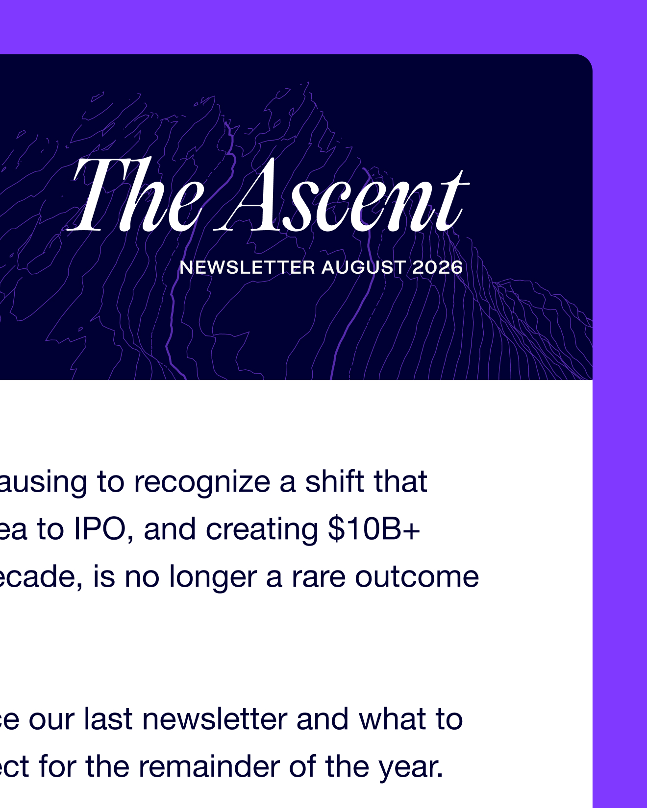
We translated the strategy into a full verbal, visual, and digital system. The wordmark moved into sentence case. The color palette was reworked while preserving the brand’s hero equity. Custom topographic illustrations, dynamic typography, mountain-perspective photography, and more candid team portraiture put the viewer on the mountain, and on the climb.
We also rebranded Surge as the seed-stage expression of Peak XV, with a distinct hero color and a younger, seed-ready visual language that stayed connected to the masterbrand. Fazer redesigned and rewrote both the Peak XV and Surge websites, creating a coherent brand experience built not around the moment money changes hands, but around the value that multiplies across the full arc of company building.