-
Client
PartnerCentric
- Industry Consultancies
-
What We Did
Brand Positioning, Narrative, Story, Tone of Voice, Visual ID and Graphic Systems, Key Messaging, Website Development & Design, Social Collateral
PartnerCentric needed help visually and verbally articulating their visionary approach to affiliate management, which had yielded massive growth for powerhouse brands like His, Hers, Carharrt, and Sprint. Perfectionistic, bold, and ambitious, they provide a top-of-funnel perspective to this bottom-of-funnel part of the marketing mix, managing accounts with custom-built tech and creative solutions that drive the true incrementality every brand seeks, but rarely finds.
Affiliate marketing is a notoriously difficult space to effectively manage and measure impact. Very few brands understand this part of the marketing mix and many affiliate agencies capitalize on the murkiness. They deliver what’s expected. They don’t over-perform. They don’t think creatively. Not PartnerCentric. An innovator in the space, PartnerCentric needed a brand that reflected their ambitious, tech-fueled approach to affiliate, which combines high-level marketing strategy with real-time channel intelligence.
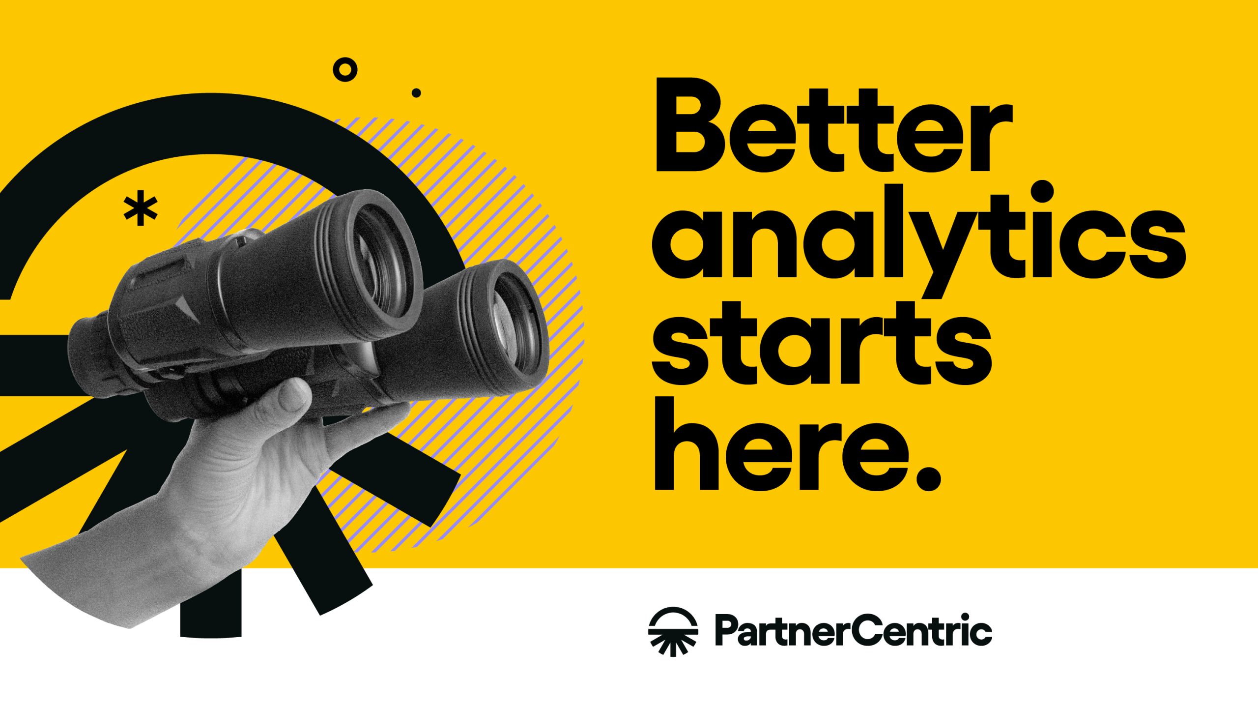
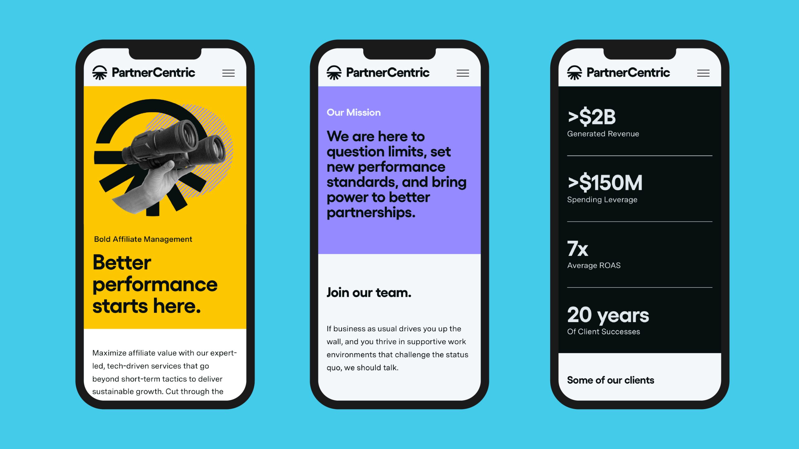
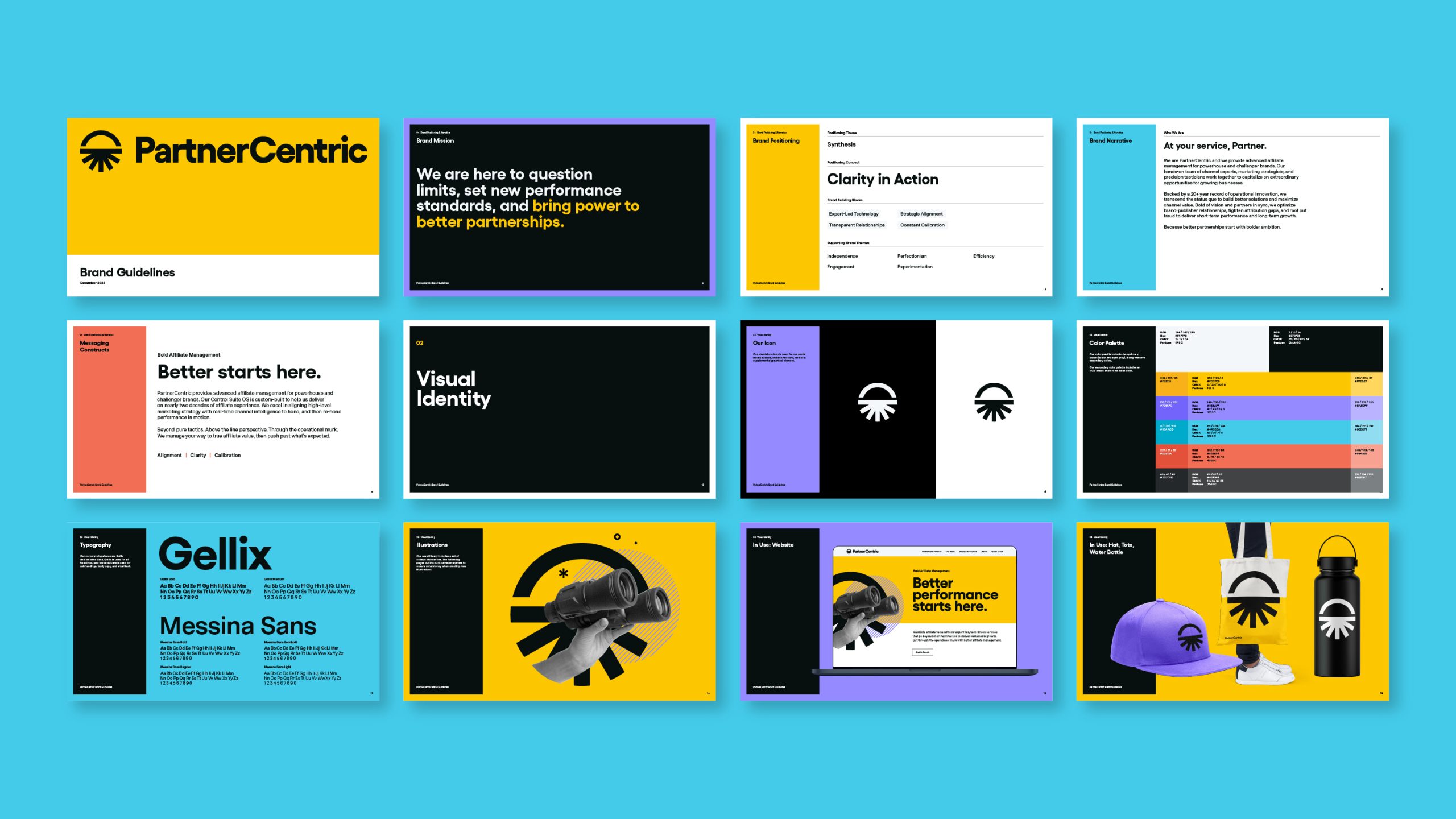
After extensive market and competitor analysis, we landed on a brand position: Clarity in Action, a singular idea that solves for the competitive set’s chief weakness: their murky approach to the channel, and addresses their customers’ hero pain point: confusion. Next, we moved into brand narrative and personality, aligning on a tone of voice to reinforce their competitive edge. The key message was clear: Better Management Starts Here.
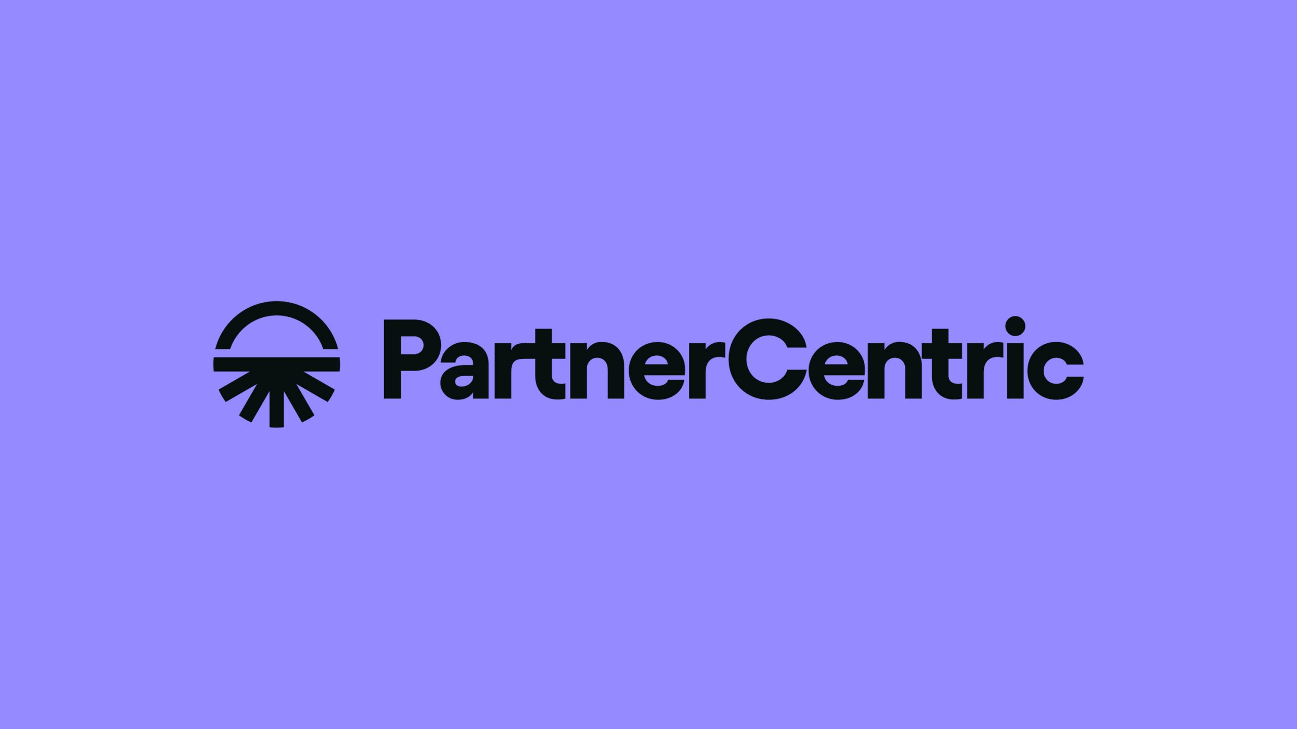
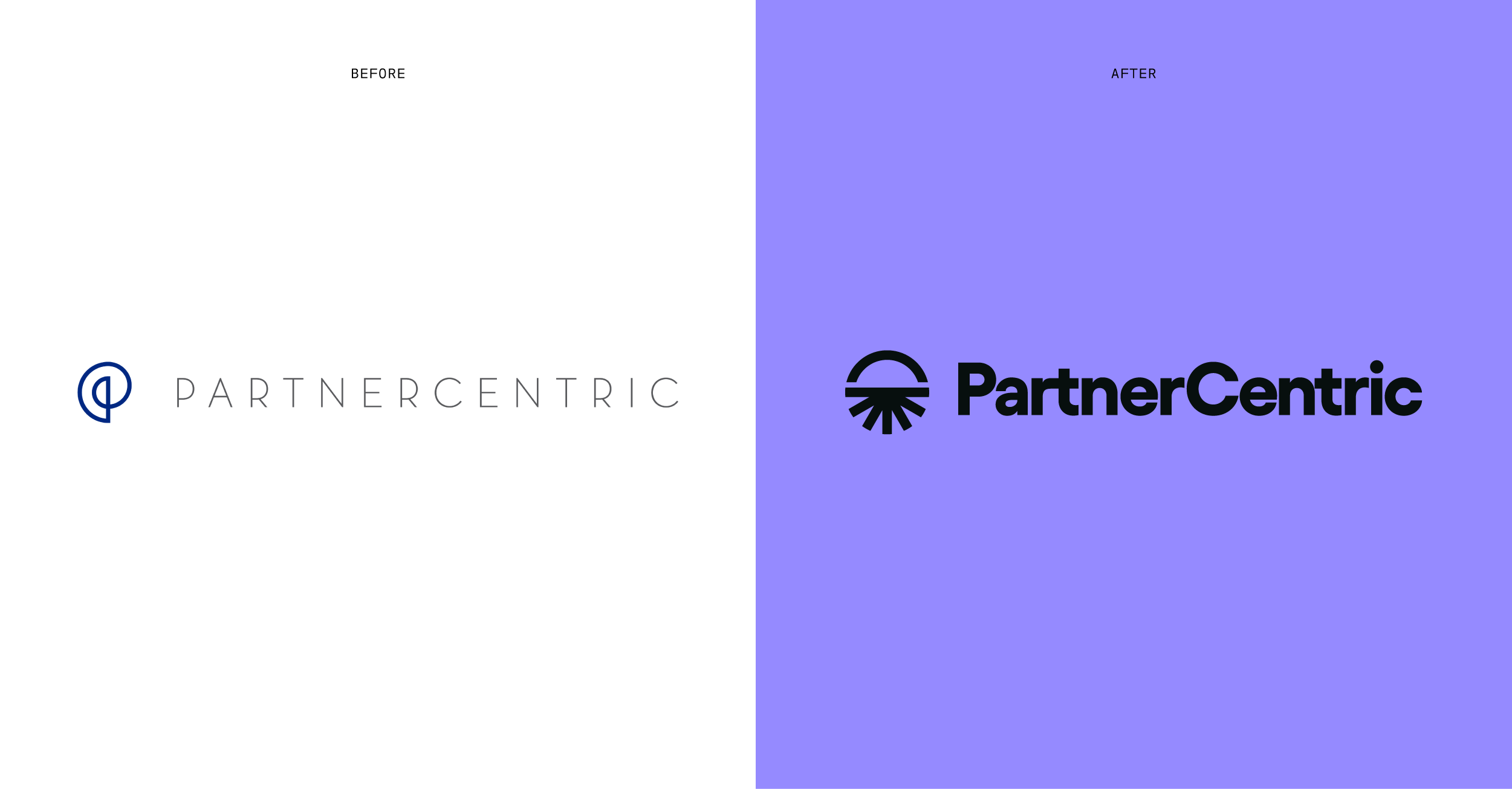
For Visual ID, we worked closely with the team to transform their look to make a major modern statement. The new icon supports a brand story about their distinctive methodology that blends long-term vision (represented by the arc), with real-time action (represented by the various rays which extend from the horizon line). Graphics are built around a pop collage approach to further drive home the new brand positioning. For example, binoculars, collaged with extensions of the new logo, represent the Partnercentric’s push to greater affiliate horizons.
All of our brand work culminated in a full website redesign, delivering a brand that was every bit as ambitious as the team behind it and priming PartnerCentric to win now and far into the affiliate future.