-
Client
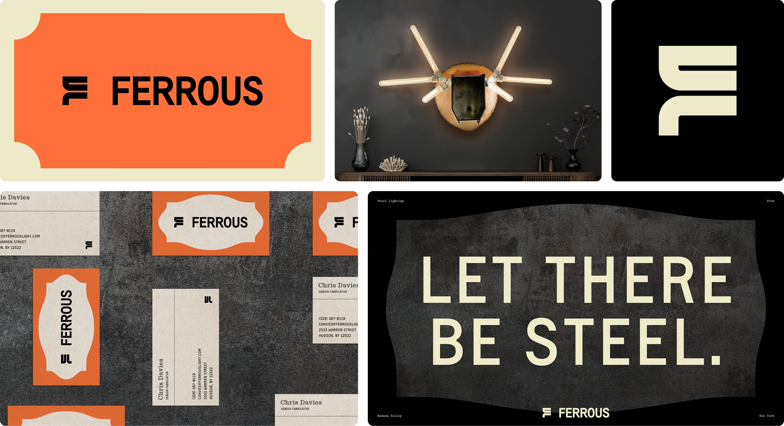
Ferrous
- Industry Retail
-
What We Did
Brand Positioning, Brand Messaging, Brand Identity, Tone of Voice, Design, Visual ID and Graphic Systems
Precious or predictable. That was the choice facing interior designers sourcing high-end lighting. Ferrous broke the mold.
Rooms built to hold a story demand better than basic illumination. The market delivered endless choices, but they were all either functional-but-forgettable fixtures or overly precious art objects that clashed with contemporary life. The world’s most creative interior designers deserved a third option.
The interior design community is drawn to singular, story-rich, and collectible objects, a territory now claimed by Ferrous. But most lighting lacked character or impact, producing fixtures that felt safely uninspired or superficially clever.
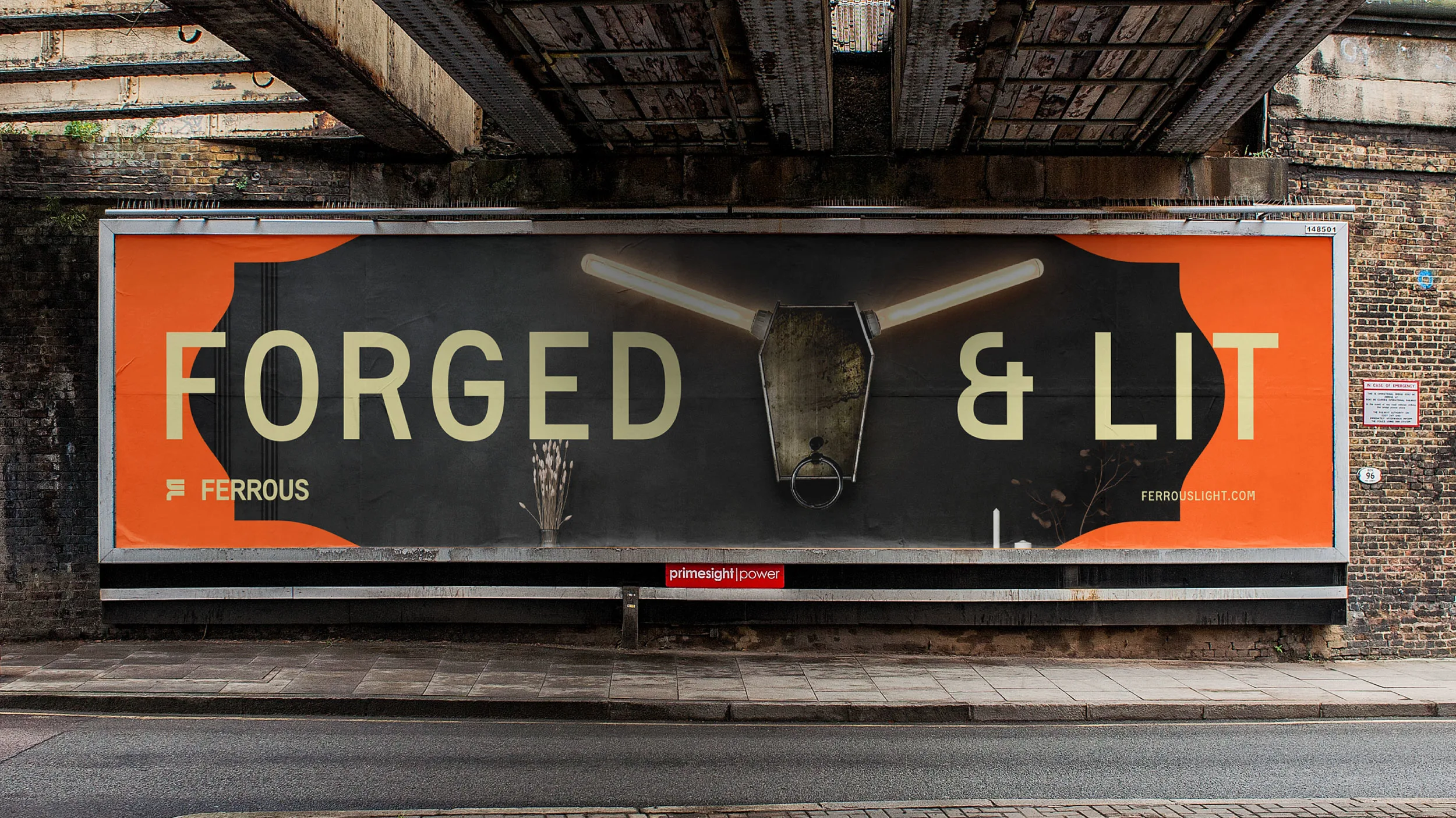
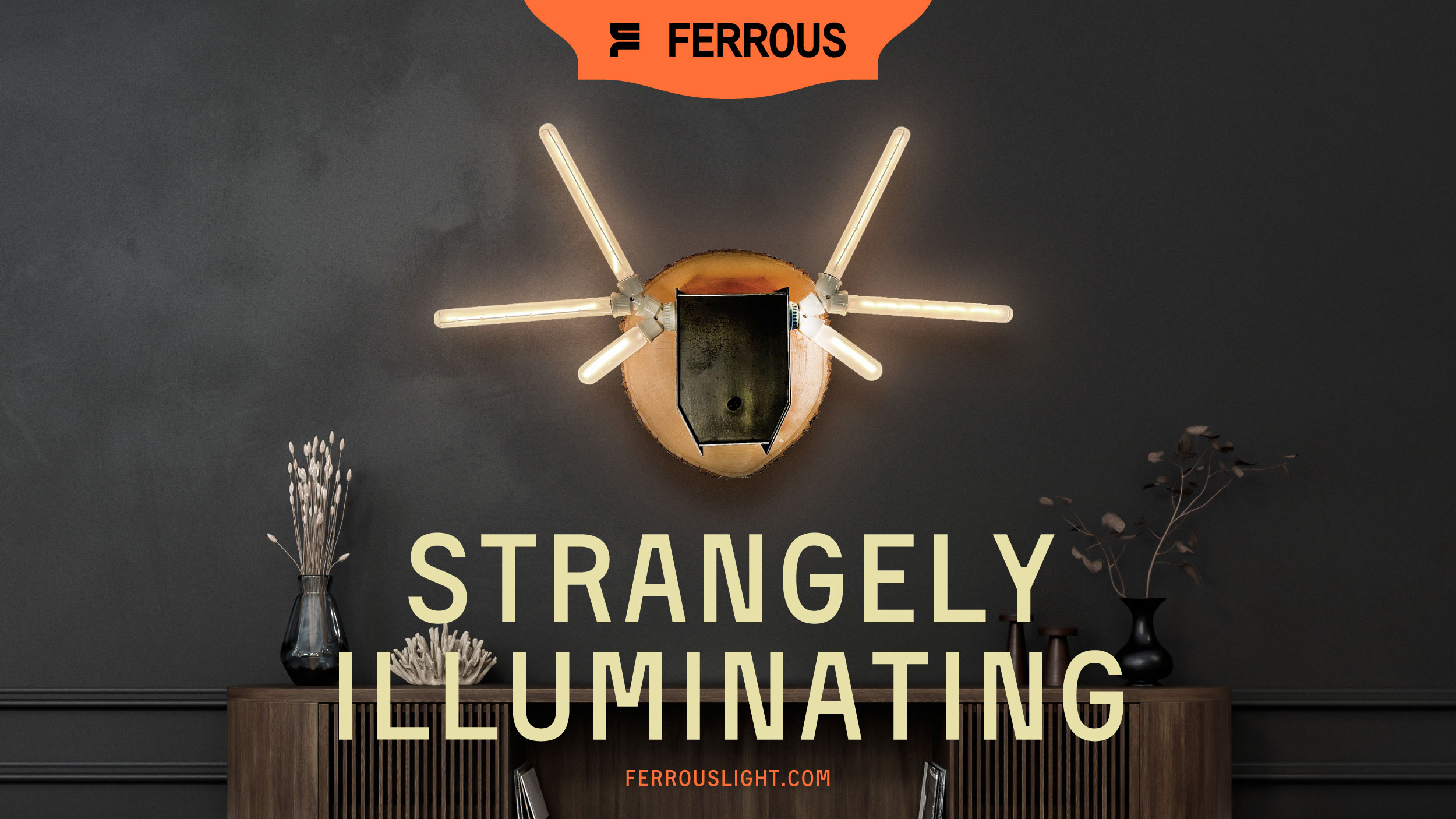
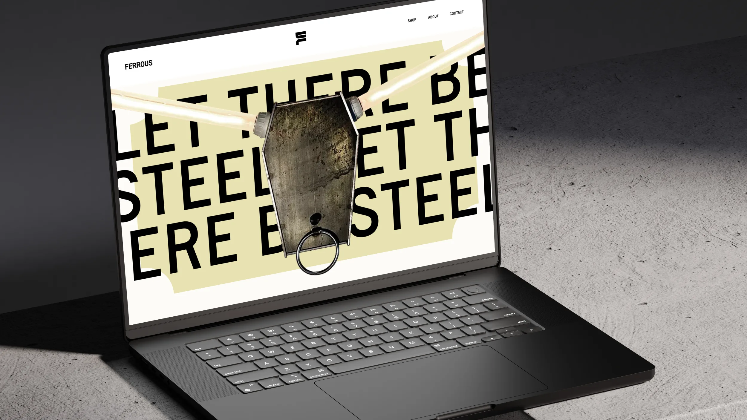
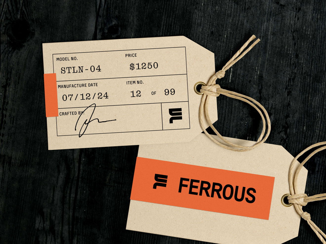
Where competitors offered decoration or function, Ferrous forged a steel-first personality and presence built to energize people, anchor spaces, and outlast any trend by 1000 years. Ferrous positioned its heavyweight lighting as collectible sculpture, and built its brand on respect for craft, material, and story — its raw integrity de-positioning the watered-down ‘safe’ options.
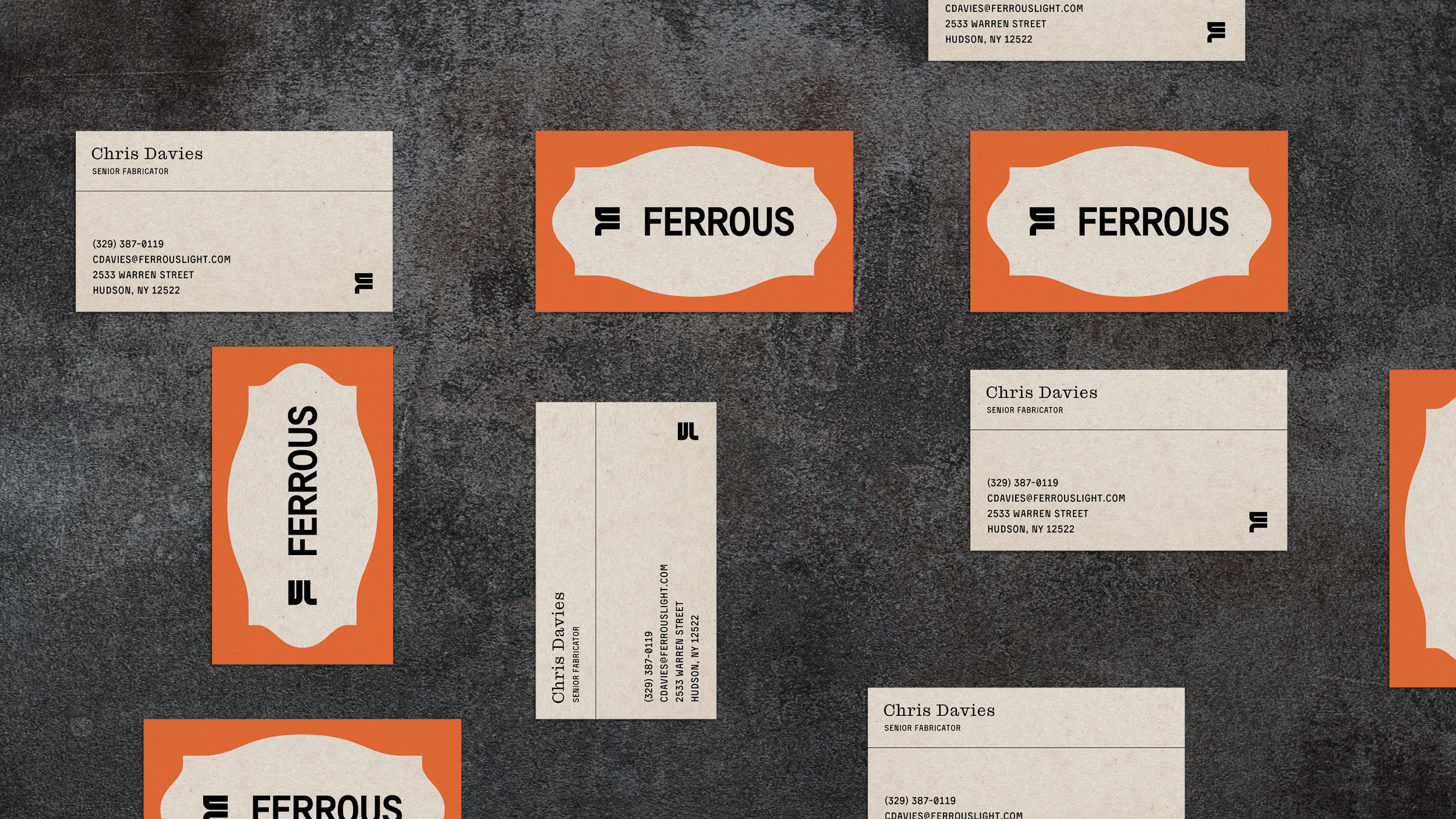
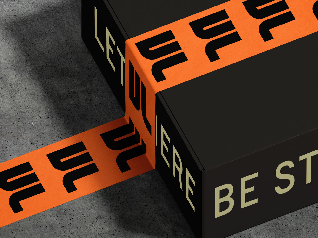
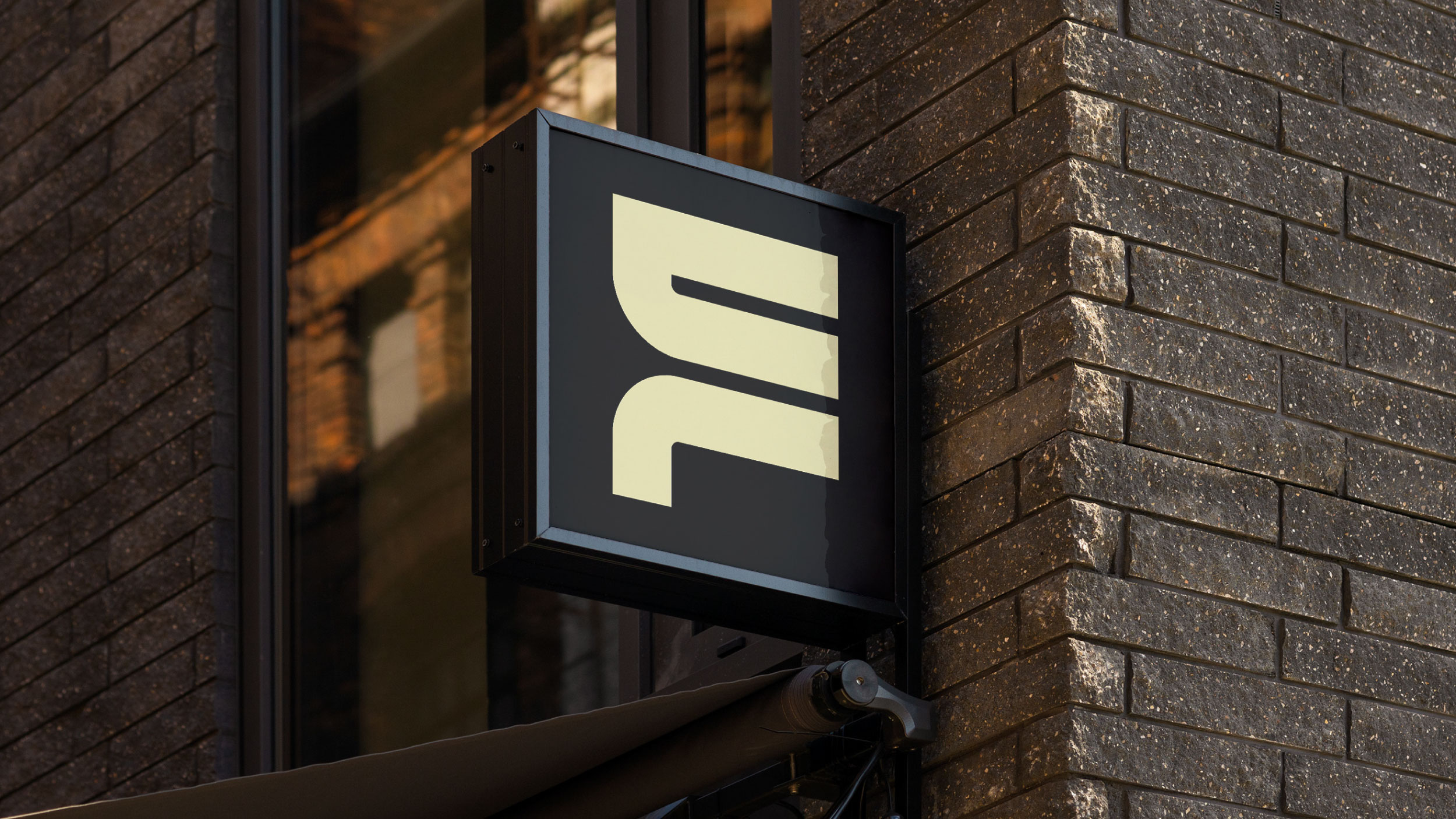
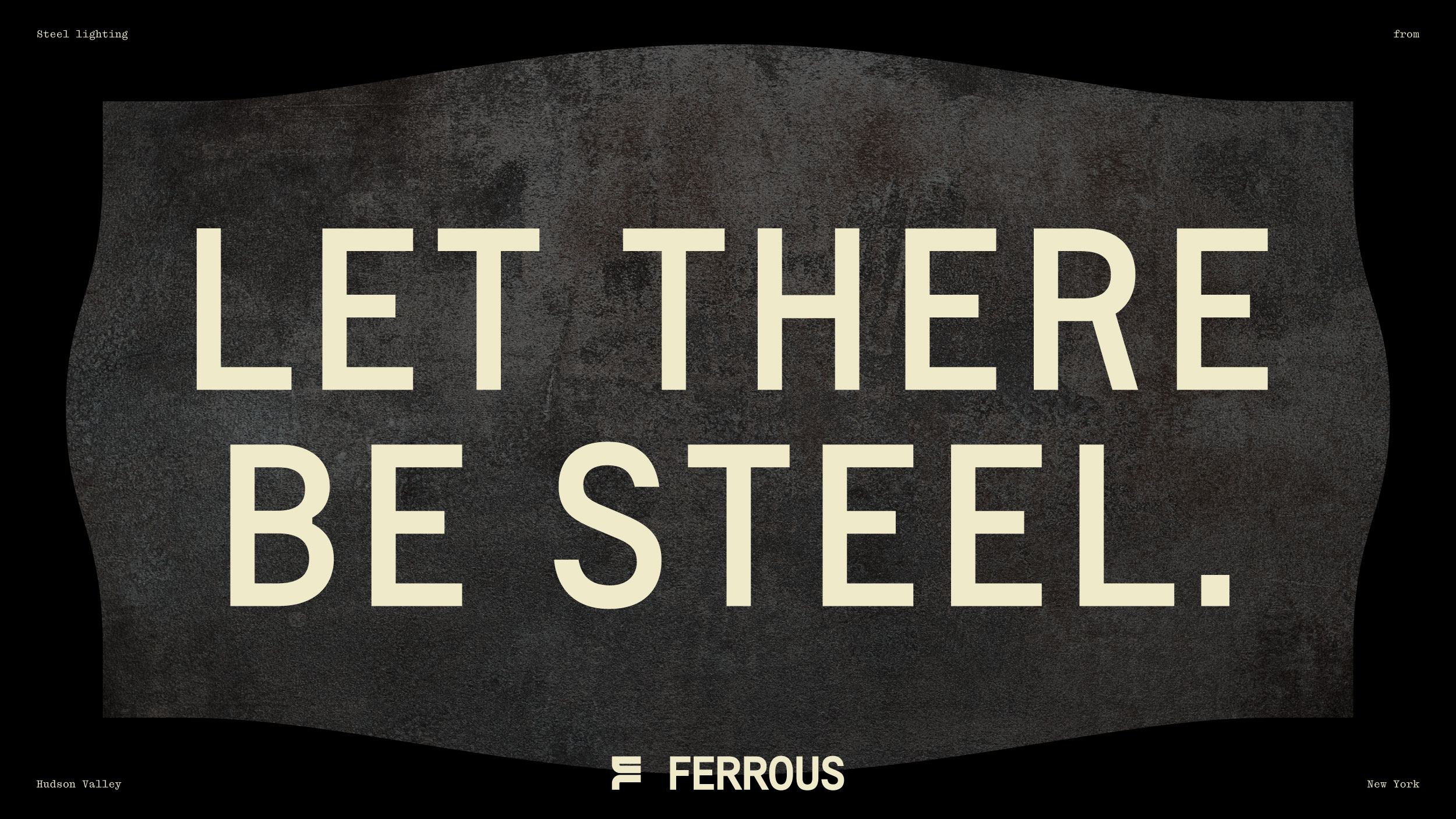
We designed the Ferrous visual system to echo steel’s weight and industrial provenance with generous spacing, minimalist forms, and a limited, mineral-inflected palette. Photography highlights fixtures as both sculptural objects and sources of light, with architectural backdrops emphasizing permanence and scale. All anchor Ferrous’ status as a ‘future relic.’
Within six months of launch, retail partnerships rose 62 percent, and direct-to-consumer sales climbed 47 percent. Eighty-five percent of new customers cited the distinctive brand identity as a key purchase driver, validating the strategy. The brand’s rapid momentum also drew national attention, with features in three major design publications naming Ferrous a “brand to watch.”