By: Todd Irwin
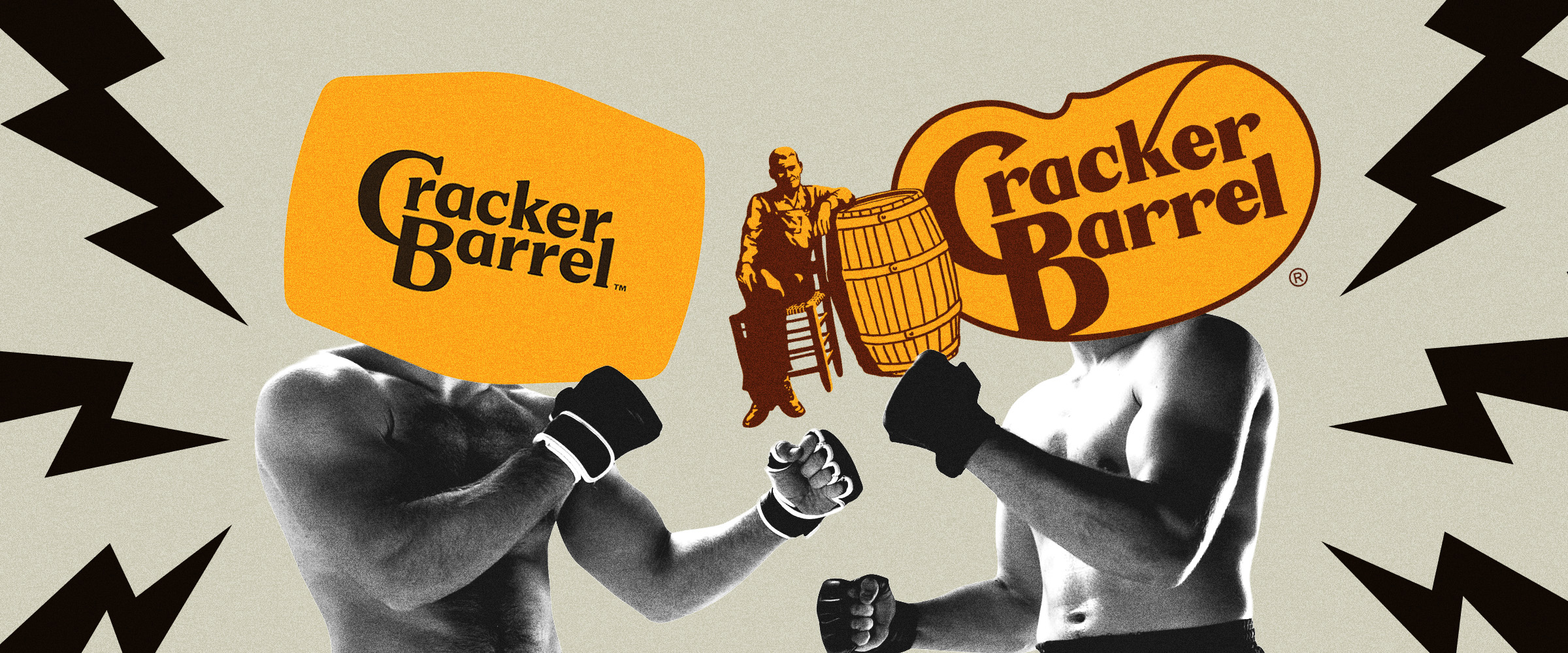
Cracker Barrel had a logo you couldn’t read from the highway. It fixed that by deleting the Old Timer and the words “Old Country Store.” Traffic fell 8%, the old logo was back within a week, and a turnaround that was already working lost a year.
You’ve heard the Cracker Barrel story told as a warning. Don’t touch a beloved brand. Leave the heritage alone.That’s the wrong lesson.Cracker Barrel needed to change. Traffic was sliding, retail was weak, and the brand was losing relevance with diners who didn’t grow up stopping there. Doing nothing wasn’t an option. So the company changed. It just changed the wrong thing.The year that followed tells you exactly what that one week cost.I’ll say something a lot of the commentary skipped. I understand why they changed the logo. The old one had a problem. But the problem they were solving and the thing they deleted were two different things. And if you’re weighing a rebrand of your own, that gap is the whole lesson.
Cracker Barrel had a problem worth fixing
Start with the business, because the business is why any of this happened. In May 2024, management laid out a turnaround plan built on three goals. Restore relevance. Improve the food and the guest experience. Get back to profitability. The work reached across the brand, the menu, the restaurants, digital and off-premise, and the company’s own people. The numbers explained the urgency. In fiscal 2024, restaurant comparable sales were flat even with menu prices up almost 5%. Guest traffic fell 5%. People were paying more and coming less. Retail comparable sales, the gift store every guest walks through on the way to a table, fell 5.5%. That’s a brand in slow decline. Not a crisis. A drift. The kind that doesn’t make headlines until it’s expensive to fix.And the fix started working.
The company went to work on the menu, the service, and the operations. It put together five straight quarters of comparable restaurant sales growth. In its fiscal fourth quarter of 2025, restaurant comps were up 5.4%.That quarter closed on August 1. The new logo launched on August 19.So the turnaround was moving before the new identity ever showed up. It wasn’t finished. Retail was still soft and traffic hadn’t come all the way back. But the plan was doing what a plan is supposed to do. Whatever the logo was meant to fix, the business wasn’t waiting on it.
The logo had a problem. The fix deleted the brand.
Here’s where I part ways with a lot of the commentary. The old logo was hard to see from the road. The Old Timer, the barrel, the chair, the lettering, “Old Country Store” underneath. That’s a lot of detail in one sign. At 70 miles an hour, most of it blurred. Sometimes, driving by, the sign was close to invisible. For a restaurant that lives on highway exits, that’s a business problem. The sign is the first touchpoint, and for a lot of travelers it’s the one that decides the visit. If it doesn’t read in a second or two, you’ve missed the exit. So I don’t fault the company for going after the logo. That’s the right instinct. A sign that can’t be read at speed is failing at its job.
The mistake was the solution.
The new identity solved legibility by deletion. A clean wordmark on a gold barrel shape. Brown and gold stayed. The Old Timer went, and so did “Old Country Store.” Inside, remodeled restaurants got brighter walls, lighter rooms, and fewer antiques. The new sign was easier to read. It just said less. It told you a name. It stopped telling you what you’d get.Think about when people choose Cracker Barrel. You’re on the interstate. The kids are hungry. You’re three hundred miles from home. Your biggest pain point is simple: “Where can I stop and know exactly what I’m getting?
The new sign was easier to read. It just said less. It told you a name. It stopped telling you what you’d get.Think about when people choose Cracker Barrel. You’re on the interstate. The kids are hungry. You’re three hundred miles from home. Your biggest pain point is simple: “Where can I stop and know exactly what I’m getting?
“The Old Timer answered that. So did “Old Country Store.” So did the rocking chairs on the porch. Before you ever took the exit, they told you this place would be the same as the last one. Same food. Same room. Same pegboard game on the table. Those weren’t decorations. They were brand cues. Brand cues are how buyers choose without thinking about it. That’s the buying science underneath it. Customers choose the brand that solves their biggest pain point most clearly. Cracker Barrel solved that one so clearly, for so long, that the answer lived in a man on a sign. This is why the legibility fix and the deletion were never the same decision. The old sign had a clarity problem at speed. Removing the cues solved it for the name and created a bigger one for the promise. A driver could now read “Cracker Barrel” faster. They could no longer read what Cracker Barrel meant. And nobody works that hard at 70 miles an hour.
The better fix was an evolution. Starbucks shows exactly how it works.
The Starbucks logo started in 1971 as a detailed brown woodcut: a twin-tailed mermaid, the Siren, inside a ring of words. Over the next forty years the company changed it three times. In 1987 it went green and the Siren got cleaner lines. In 1992 the logo moved in close on her face. In 2011 the words came off the symbol entirely.
The Siren was never banished. She was modernized, a little at a time, until she could carry the brand on her own. Then look at how Starbucks handles its name. It took the wordmark off the symbol and let the two work separately. The Siren is a simple icon with no lettering inside it. “Starbucks” is its own wordmark. Each one does one job, and each one does it better because it isn’t crammed inside the other. Cracker Barrel already had half of that answer. The redesign evolved the wordmark, and the new one was easier to read from the highway. That part was right. The mistake was the Old Timer. Instead of evolving him too, they deleted him.
The fix was the Starbucks move. Keep the cleaner wordmark. Redraw the Old Timer and his barrel as a simple icon: fewer lines, a bolder shape, more contrast. Let the two work separately. The name reads at 70 miles an hour, and the Old Timer still tells you what you’re getting. KFC has done the same with the Colonel again and again over the decades, and he’s still a main asset of the KFC brand identity. Simplifying a brand cue makes it work harder. Deleting it makes the customer do the work.
After the reversal, the CEO said the company’s research hadn’t captured how much “our guests see themselves and their own story” in Cracker Barrel. That’s a huge miss. Research can tell you whether people like a cleaner restaurant once they’re sitting in it. But it should have also told them what the sign was doing on the highway, not just stating the place, but delivering the feeling.
Those weren’t decorations. They were brand cues. Brand cues are how buyers choose without thinking about it. That’s the buying science underneath it. Customers choose the brand that solves their biggest pain point most clearly.
What it cost
In the first half of August 2025, restaurant traffic was down about 1%. After August 19, it was down about 8%. The company moved fast. The old logo came back within a week. The remodel program stopped. The four fully redesigned restaurants went back to their old look, and remodel work at 58 more was halted. Speed contained the headlines. It didn’t contain the damage. Restaurant comparable sales fell 4.7% in the first quarter of fiscal 2026 and 7.1% in the second. Retail fell 9.2%. The company cut its outlook, cut costs, and cut advertising. The recovery came after the Old Timer came back and the company put its attention back on the kitchen. By the third quarter of fiscal 2026, restaurant comps had improved to minus 2.6%. By the summer of 2026, a year after the launch, they were still down about 2.5%, and retail had only just turned slightly positive.
Better. Not back.
The logo didn’t just cost Cracker Barrel a week of bad headlines. It interrupted a turnaround that was already working. Guests should have kept coming. The momentum should have carried into the new year. The remodel program should have been scaling. Instead the company spent a year climbing back toward where it started. And here’s the part that should worry any CEO planning a rebrand. One wrong decision about brand cues put the rest of the plan on hold with it.
Change what isn’t working. Keep what is.
This is a basic business principle, and a rebrand is where it gets forgotten. Before you change anything, make two lists. The first is what’s broken. For Cracker Barrel, that was traffic, value, parts of the menu, parts of the experience, a thin digital relationship with younger guests, and a sign you couldn’t read from the road. All of it deserved the investment. None of it required erasing the brand. The second list is what your customers use to choose you. A message. A name. Your color. And yes, your logo. Many rebrands throw these away, many times because somebody inside the organization got bored and didn’t spend enough time to figure out what they’re worth.
Here’s the test. For every cue on the second list, ask what pain point it answers for your buyer. If it answers the biggest one, it stays. It can be redrawn, simplified, scaled, and modernized. It can’t be removed. Then test it where the choice happens. Cracker Barrel’s choice happens on a highway, in a second, with a car full of hungry people. Yours might happen on a search results page, in an AI answer, or in the first ten seconds of a sales call. Wherever it is, that’s where your brand cues have to work. A conference room isn’t that place. Cracker Barrel could have had a better menu, a better app, brighter dining rooms, a sign you can read at 70 miles an hour, and the Old Timer on it. None of those were in conflict. The customers knew that before the company did.
A rebrand should sharpen your sword. It shouldn’t reset you to zero.
Talk to us.
If your brand is invisible in AI search, the cause is almost never technical. It’s strategic. The brand never owned a Hero Pain Point clearly enough to win the decision. We’re a senior-led brand strategy firm built around one methodology: De-Positioning. We help CEOs, CMOs, and ambitious founders clarify the problem they own and build brands that win the decision. Whether the buyer is a human or an AI. If that sounds like the firm you’ve been looking for, schedule a call.
FAQs